Burrito Bison: Launcha Libre – UI Design Process
A Small Studio’s UI Design Process

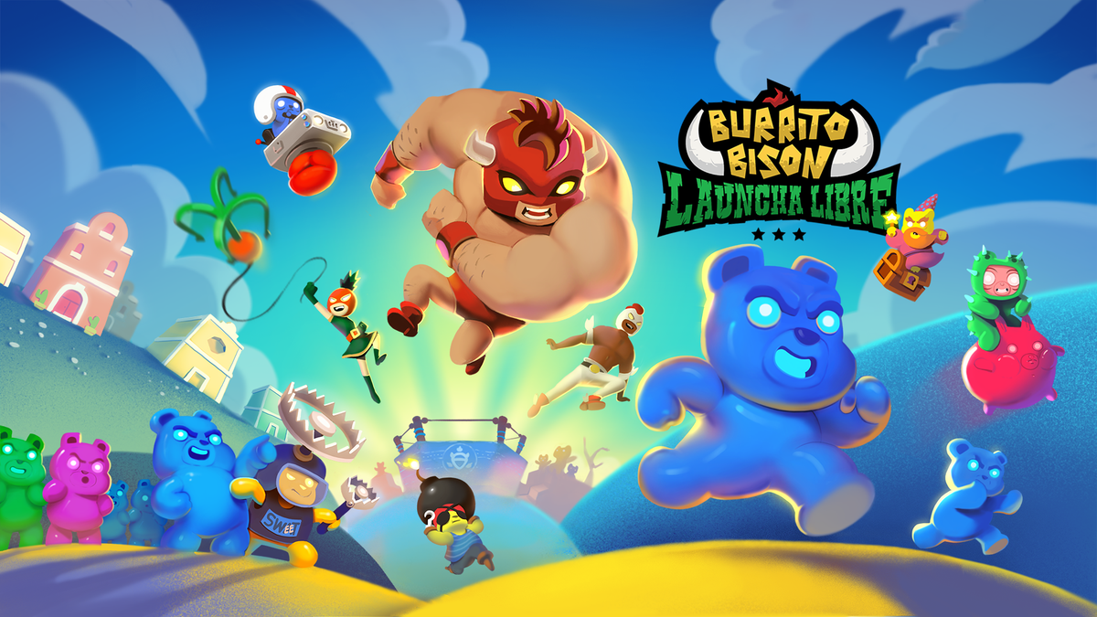
Hi there, I’m Yowan Langlais, co-founder and UI-UX designer (among other hats I also wear) over at Juicy Beast. We’re an indie studio based in Montreal, Canada, and we specialize in colorful, quirky action games. We’re mostly known for the Burrito Bison series and Knightmare Tower, but we released over 15 games on almost all platforms since 2009.

Being a small 4-person team, our UI design process probably differs a lot from other bigger studios. What follows is an abbreviation of our UI design process for Burrito Bison: Launcha Libre, a mobile F2P launching game (the 3rd in the series).
Quick FYI before we start:
- I’m a self-taught UX-UI designer with over 11 years of experience. I learned pretty much everything by trial and error over the years.
- We usually make small, simple games, so I can afford to skip some of the more time consuming UI design steps (like navigation flow graphs, intensive user testing, etc).
- This game was the 3rd in the series so I already knew where I was going with the UI. I didn’t have to do a lot of research, like I normally do.
Step 1: Preparation
No matter the project, preparation is key. In my case, I always start with a simple list of overall game features. I sit down with the team and make sure we all agree on what’s going to be in the game. For Launcha Libre, we came up with something like this.
- Fight against opponents in a wrestling ring
- “Launching” mini-game
- “Upgrades” shop
- “End of run” details
- Various currencies
- Missions / quests
- Etc.
From that list, I define all the different menu screens / UI sections that are going to be needed for those features.
- Fight against opponents in the wrestling ring → Life bars à la Street Fighter
- “Launching” mini-game → Success / failure feedback
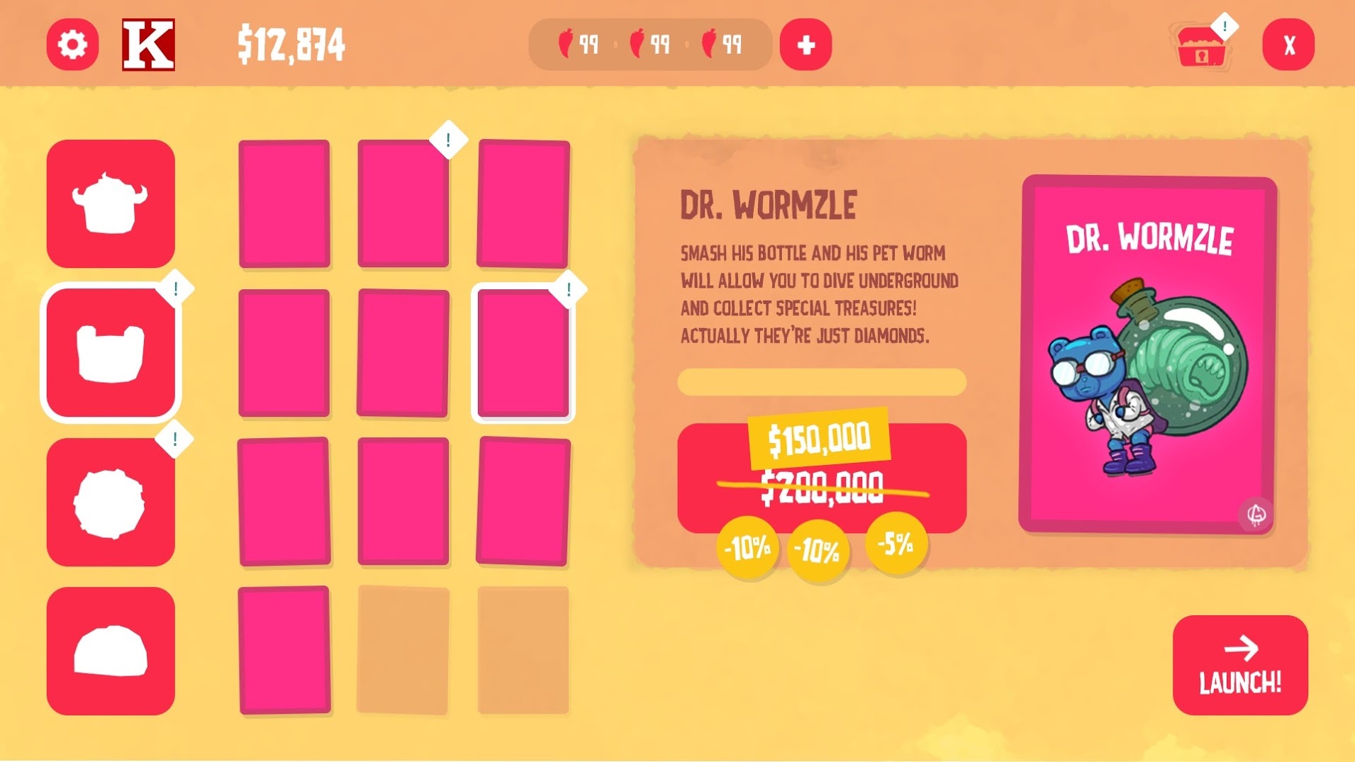
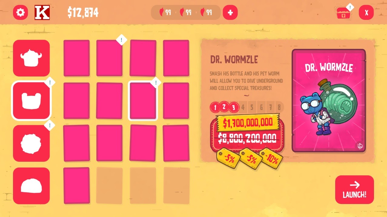
- “Upgrades” shop → Shop screen
- “End of run” summary → Debriefing screen
- Various currencies → HUD overlay and collection feedbacks
- Missions / quests → Missions screen with list of active missions and rewards
- Etc.
I obviously also plan for other classic screens like the Title screen, Setting screen, etc.
Once I’ve listed all the screens I think we’ll need, I try to identify the most important, or complex one. That’s the screen I’ll start designing mockups for first. I do this because this screen is usually either the one that players will interact with the most, or it’s the one that has the widest variety of elements in it. Either way, designing this screen first will make designing the rest of the UI easier.
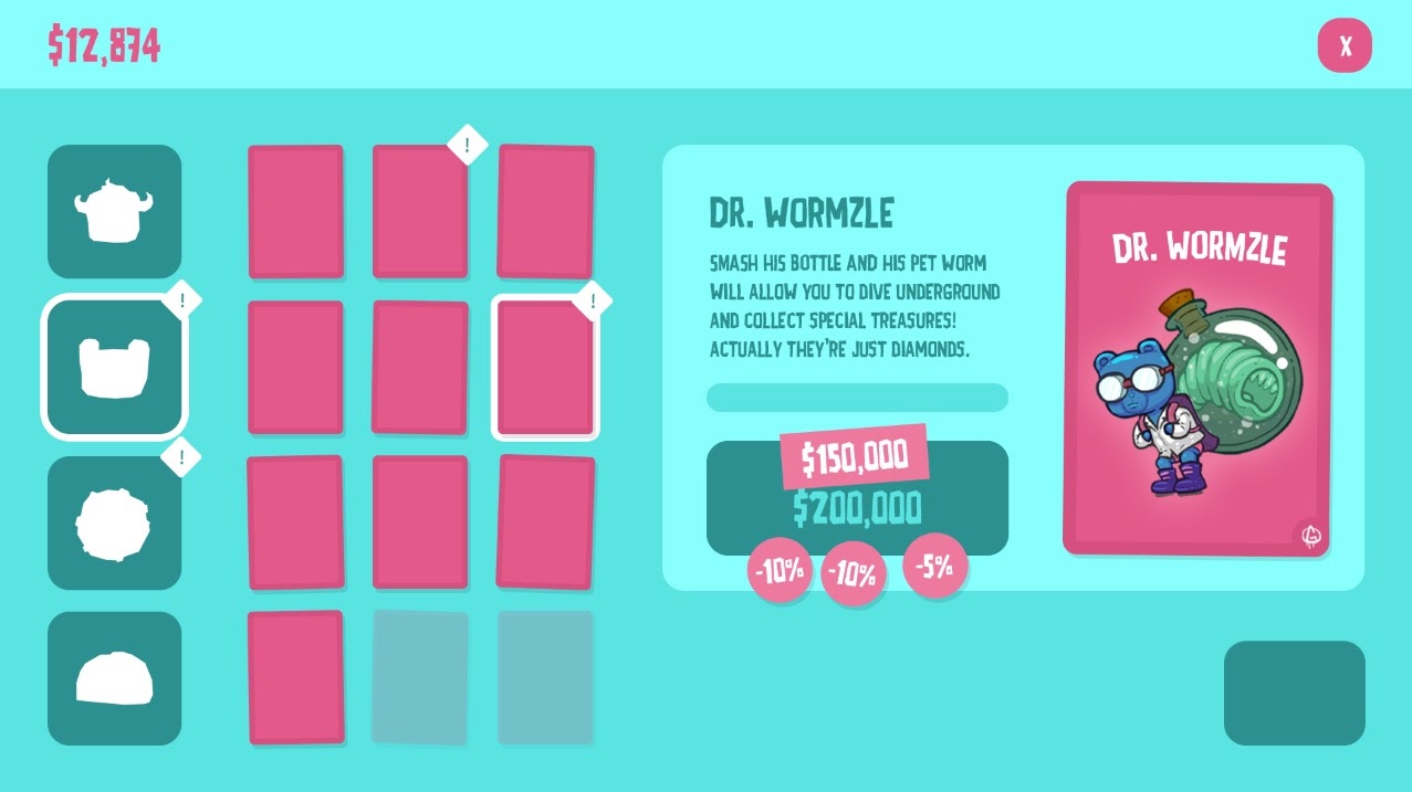
Finally, once I’ve identified the first screen, I do another list of all the elements that might be present in that screen. If I’m starting with the Shop screen, my list might look like this.
- Item category tabs
- List of items in a category
- Highlight cursor
- Close-up item image ★
- Item description text
- Item price ★
- “Purchase” button ★
- “New Item” marker
- “Available Item” marker ★
- “Discount” tag ★
- “Proceed” button ★
- Etc.
I also put little stars beside the elements I think will be the most important for the player. This is so I can make sure they’re big / obvious / easy to interact with enough. Zach Gage wrote a great article called “Designing for Subway Legibility” that goes much deeper into this idea of visual hierarchy.
Another (somewhat related) thing I try to do while designing UI is try to think of the game’s marketing. More specifically, I try to make sure that potential players can easily identify our game’s genre by looking at the screenshots on Steam, for instance. I won’t dive into it here, but I suggest you read this great article by Adam Saltsman about “Screenshot Theory”.
Step 2: Layout Mockup
The first thing I do in Photoshop (or Adobe XD) is a layout mockup. I set up a grid and use rectangles to start blocking out where the different elements (especially the ones with a star next to them) will go on the screen.
I also find a font that fits the style of the game and add some text here and there to get a sense of how big I can afford to make it based on the total screen real estate. Here’s one of the first mockups I did for Launcha Libre.
I wanted a layout flow that would go from left to right smoothly, starting with the category tabs, the different upgrade cards, the purchase button and finally the proceed button at the bottom right. This way, your thumb can glide over the screen in a single movement, letting you go back to the game quickly.
Here you can see that I added more elements and experimented with a different color palette. I was slowly starting to play with art direction too (see the textures). Colors were inspired by the streets of Mexico, with all the super colorful houses and earthy textures.
Normally, at this point, I’d try to add as much content as possible to make sure everything can fit in. If the mockup looks noisy and is hard to read once all the elements are in place, I either evaluate if I can cut less important elements out, or try to “hide” them in submenus / split them in different screens, etc.
More art exploration! This version of the mockup had almost all the necessary elements at that time. We ended up adding more in future updates, so leaving a bit of empty space is usually a good idea if you don’t want to redesign everything all the time.
Here’s what the final screen looks like, so you can see how close I was to the final design at the time.

Step 3: Interactive Mockups
Once I reach a point where the mockup looks good while containing all the necessary information, we start implementing it in Unity so we can interact with it in the game’s context. The mockup might look good on paper but we have no idea if it’s intuitive or easy to navigate.
In the event that the UX is confusing or cumbersome, anyone on the team is free to tinker with it and recommend their own fixes. I say I’m the UX designer, but that’s only because it’s my job to oversee it. I think everyone on the team is contributing to UX design (whether they want to or not), from our illustrator with his choice of color and shapes affecting affordances, to our programmer coding how / when / where feedback elements will pop on the screen.
I believe UX design is a skill everyone should learn at least a little bit in order to make designing clear and intuitive games faster and easier. A fun place to start is this video about UX design by Extra Credits, or this one about affordances. Another fun UX project is the 52 Cognitive Bias UX Cards by Laurence Vagner and Stéphanie Walter.
Step 4: Art Direction
Once the UX feels clear and intuitive, I normally proceed with more serious art direction exploration. In the case of Launcha Libre, I was able to experiment with art direction early on because I already knew that the core of the layout was functional (being the 3rd in the series). Normally, I’d use a mix of Pinterest and Milanote for research and mood boards.
Depending on the art direction I choose, I sometimes ask our illustrator to draw certain pieces of UI elements, like this piece of worn out paper I use for pop-ups and floating windows. I can’t draw that well, so having our illustrator draw the UI really helps tie it to the rest of the game’s hand-drawn style.
Once I’m happy with the art direction, I try my best to define a visual language for all the different elements (buttons, icons, colors, typography like titles, body text, etc) and stick to it throughout the whole UI. By that I mean that all elements should look consistently the same and not change from one screen to the other to avoid confusing players.
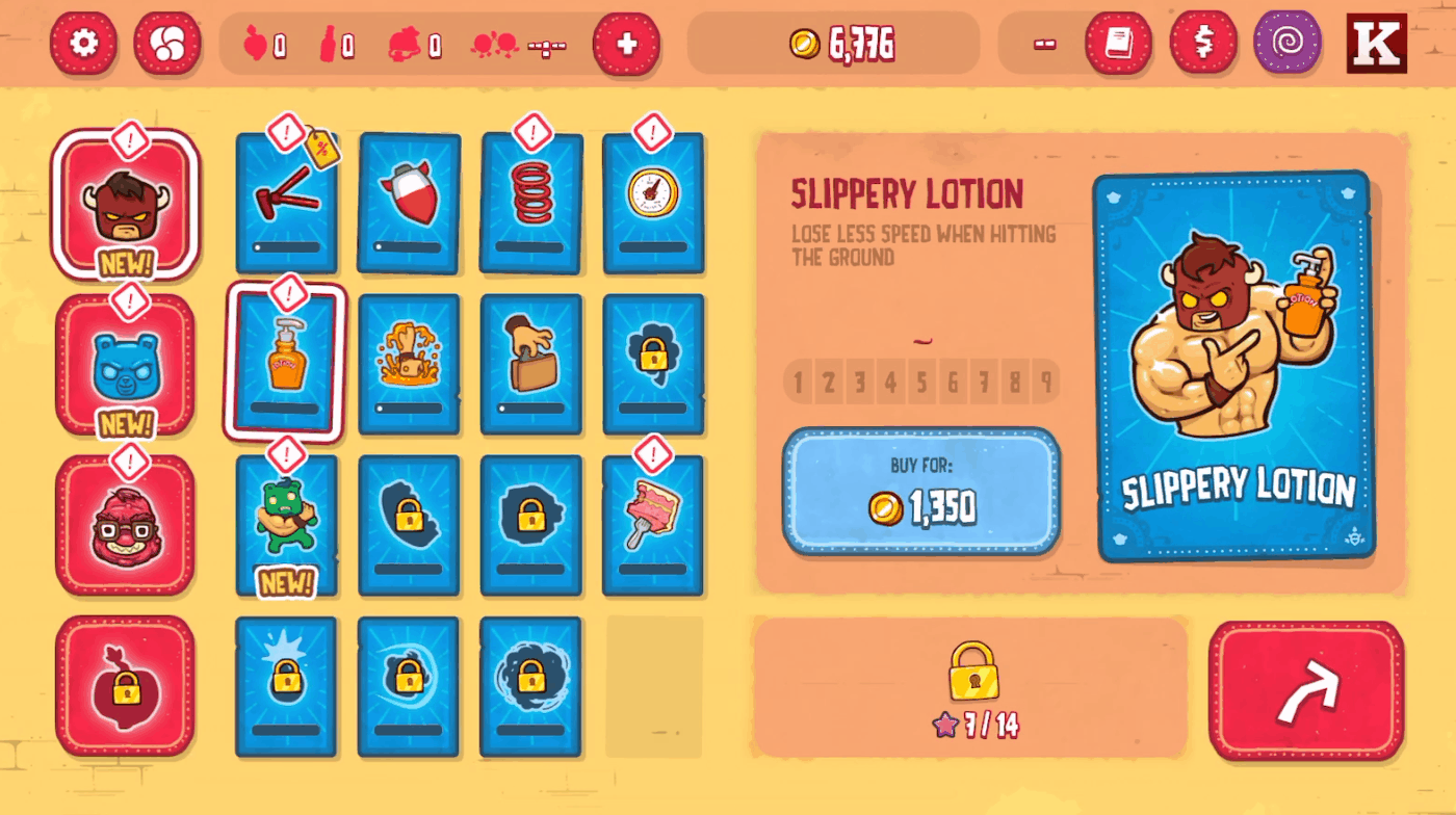
Here you can see how all buttons share the same visual language, even if they perform different actions. They share the same rounded corners, the same decorative borders, the same shadow, as well as the same bouncy click animation.
I also use colors to define what type of content or action the buttons are associated to. Red buttons are generic buttons that are associated with menu navigation, blue buttons are related to spending coins, purple is related to the Time Travel mechanic, etc.
I often add more rules to the visual language by working on other pages later on, and if necessary, I go back to previous pages and adjust them so they’re in line with the new rules (i.e. I just noticed that buttons will need an extra state to support a feature in another page, so I go back to the first page and add that state).
Step 5: Iterations
I keep doing the steps above until all the necessary pages are designed (both art and layout). I do this back and forth a lot at the beginning, but at some point my “toolbox” of visual language becomes full enough that I can simply start to re-use elements to build new pages on demand. That’s why I always start with the most complex page first!
At this point, I start exporting all the UI art assets from Photoshop so we can replace the UI mockups in the game. I use Photoshop’s Generate > Image Assets tool quite a lot.
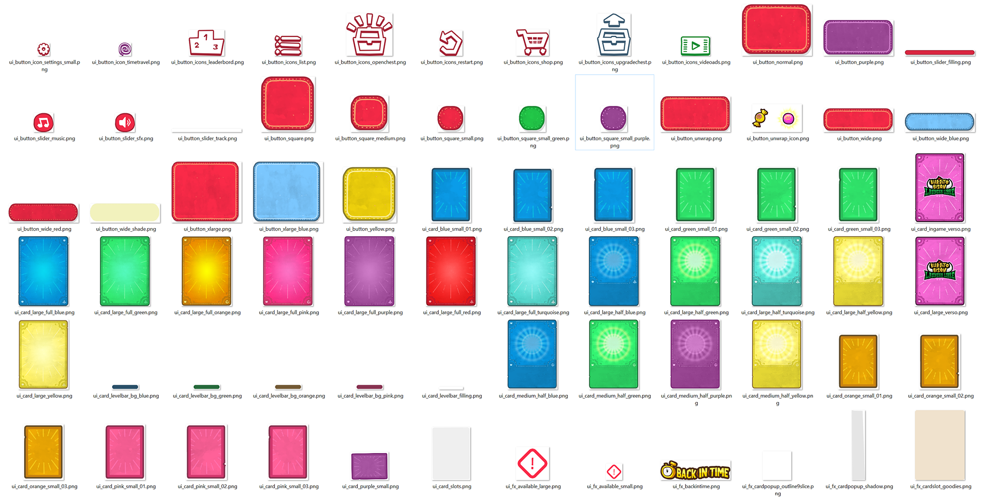
We’re a very small team (4 people), but I pretty much never integrate my own UI, as the other members of the team are much more technically skilled and faster at it than me overall. They usually integrate everything while I design other UI sections, or while I help with animation, or work on marketing, etc.
For this reason, I try to be mindful of how I design the different elements by either reusing a lot of parts for optimisation purposes (often necessary on mobile), or by making things less optimized but much more easy to implement (often a balance between the two).
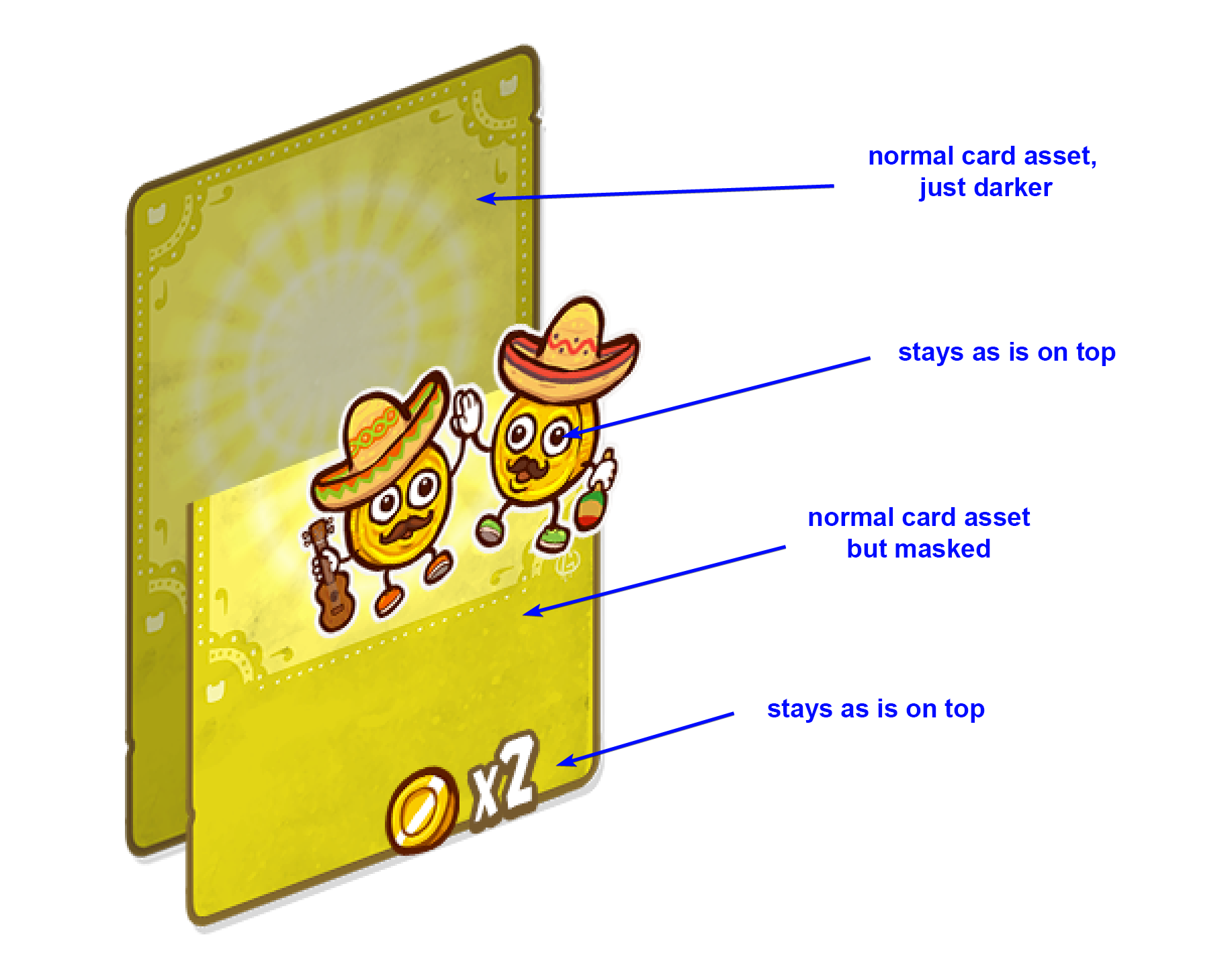
Here’s an example of me explaining to our programmer how I designed a card that also acts as a meter that fills up. I’m only using a single card asset for optimisation purposes, but that means we have to modify it with some simple shaders to make it work.
The final steps are basically a loop of implementation and polishing / fixing things like alignment, states, animations, feedback, etc, until everything looks and is functional.
Conclusion
Over the years, I’ve adapted our process to both the size of our team and our individual skill levels. Our process works well for us making small games, but it’s probably too simple for bigger studios or games. Even though this was an abbreviation of our process, I hope you’ve managed to learn something useful. Thanks for reading 🙂
You can see the complete Burrito Bison: Launch Libre UI on Behance.
Extra Bits
- I always design our games’ logo in Illustrator. That step comes pretty late in the dev process.
- I do a bit of animation, both gameplay and UI animations, in Adobe Animate (Flash).
- We have our very own Animate → Unity exporter. You can see all the tools we use here.
Another UI design article I wrote about “Designing a Playable UI that Secretly Teaches How to Play”.
Recent articles
Interview with Stephan Dube
Principal UX | UI Designer at Arrivant

Wireframe Video Game Design
60+ Wireframe Mockup PSD Design
Interview with Michal Jarolimek
UI programmer at Warhorse Studios
Interview with Marc Sodermanns
Lead UX Designer at Massive - a Ubisoft studio
Interview with Nicolas Kraj
UX Director at Ubisoft and Creator of GDKeys
Interview with David Sheldon-Hicks
Founder at Territory Studio
Interview with Emmanuel Vasquez Jr
Senior UI Artist at Gameloft
Interview with Sarah Robinson
Lead UI Designer at Behaviour Interactive