Cyberpunk 2077 — UX/UI Critique
Beautiful but flawed By Aiden Le Santo

Spoilers?
There are no significant story spoilers below, but some screenshots contain details about early main missions, side quests or items in the game.
Introduction
This article focuses mostly on UX (User Experience) and UI (User Interface) problems but will stray into other aspects of design, where the line between them blurs. I don’t call myself a Game Design expert, though, and I’ll be examining everything through a UX-focused lens.
With an eight year ride on the hype train, Cyberpunk 2077 was hotly anticipated as CD Projekt Red’s next masterpiece after their renowned The Witcher 3: Wild Hunt. Players were promised a reactive futuristic world overflowing with detail, setting a new standard for open-world RPGs.
Whether it was worth the wait or another victim of hype, I’m setting crunch or controversy aside to think about the interface. After 60+ hours in the megalopolis of Night City, the art has astounded me and the characters have gripped me… but I’d like to give my take on what intrigues me the most.
Whilst the UX/UI of a game may typically be overlooked, it can’t be underestimated as a key component for holding systems together. Skilful interface design facilitates the player’s journey through all the elaborate mechanical pieces without friction or frustration.
Does the user interface of Cyberpunk 2077 help or hinder goals of immersion and player agency? Which design choices are holding it back, and how can they be improved going forward?
Process
Cyberpunk 2077 owes its origin to a classic pen and paper RPG. My analysis also starts on paper. While my own V made his way through Night City, I jotted down many ideas about the UX and UI.
The important thing is that I can decipher it
I found that most issues fell into one of two categories:
- Efficiency regards issues that hinder the player when accomplishing jobs or the flow through tasks.
- Immersion is concerned with problems that interrupt the player’s feeling of presence within the world.
Although I found more issues around Efficiency, the problems with immersion (or a lack of it) were some of the most detrimental. They affected the experience in an overarching way, rather than smaller scale frustrations dotted throughout the menus.
High-Level Strengths
While failures tend to offer the most potential for learning, accomplishments are deserving of mention. There are many elements of the UX/UI, and the game as a whole, that I thought were successful.

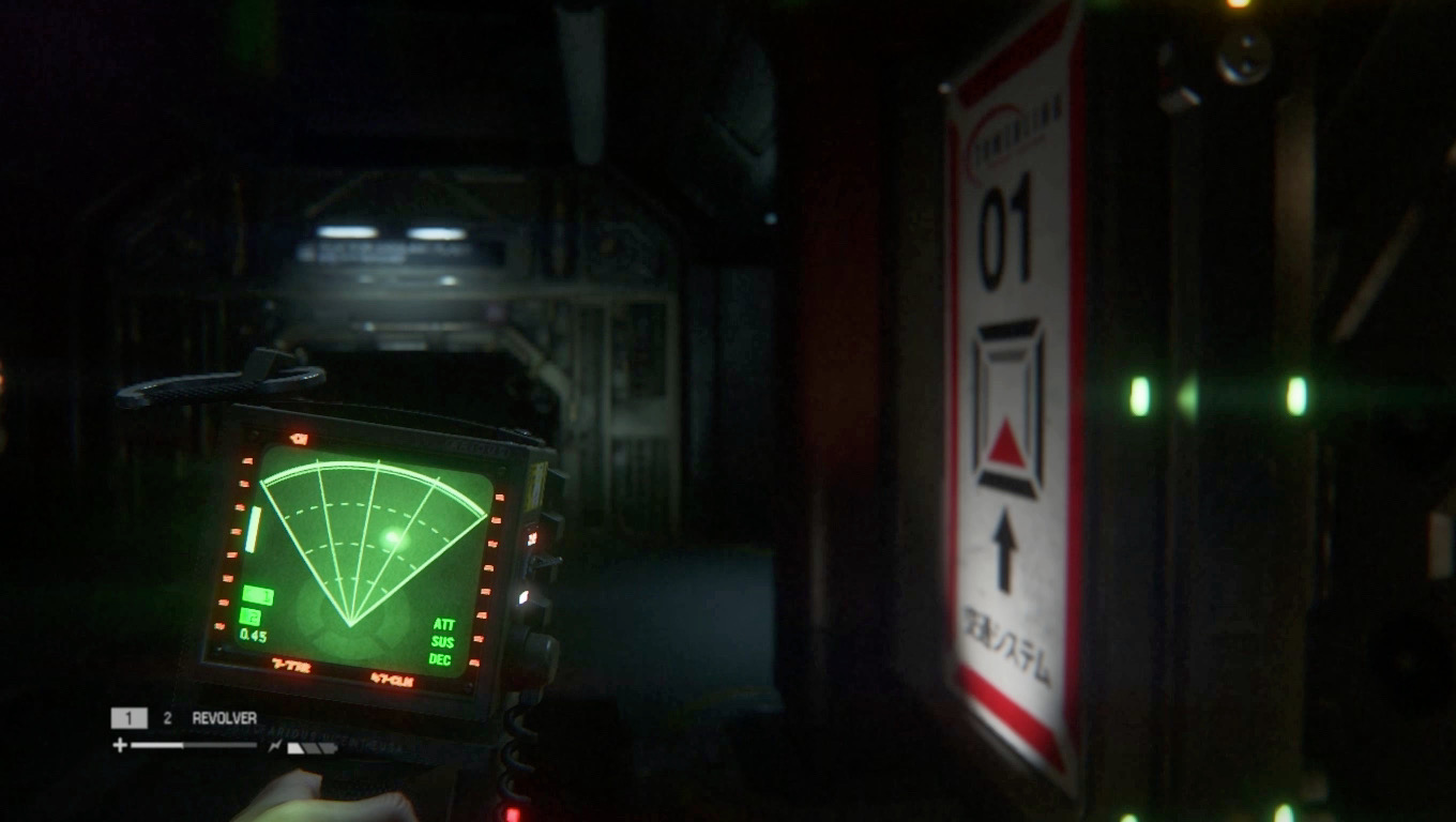
Left: Cyberpunk 2077’s main HUD, Right: One of the hacking interfaces
Aesthetically, the interface carries the cyberpunk theme throughout with a stylish tone. Sci-fi games often fall prey to clichés, feeling like watered down clones of one another. Cyberpunk 2077 may play on familiar tropes, but with skill and identity that sets it apart.
This doesn’t come as a surprise; I’ve always felt like CD Projekt Red’s strengths lie in the artistic side of things. It’s difficult to find anything that isn’t beautiful (the drawback is that UX slip-ups become all the more glaring).
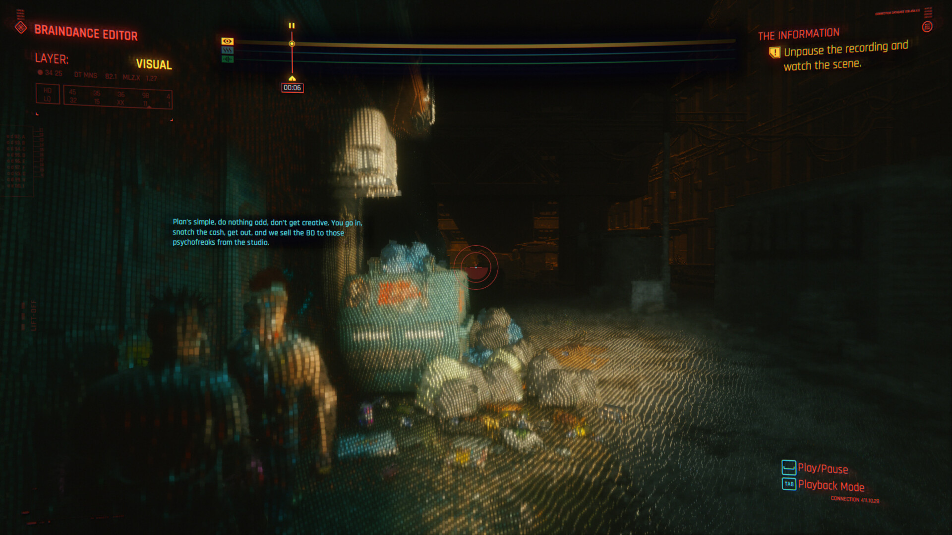
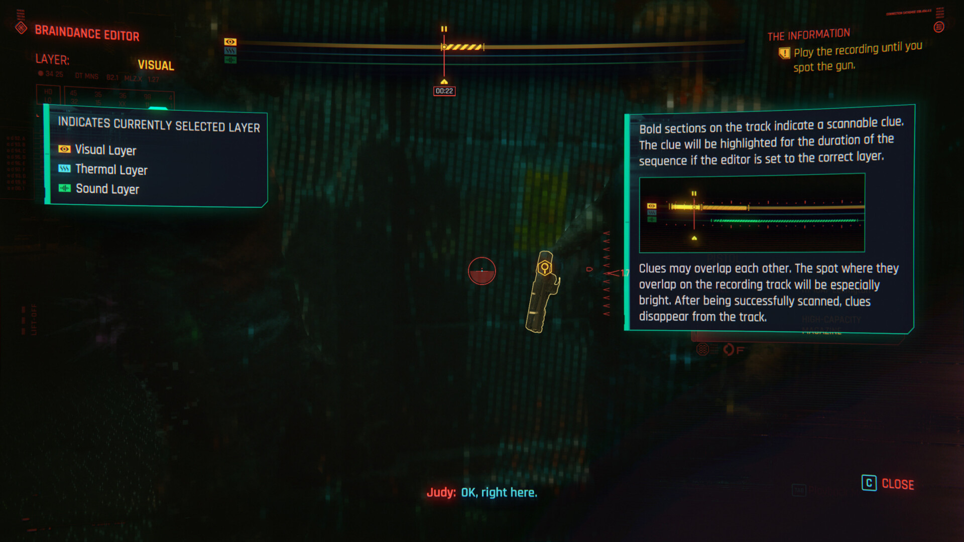
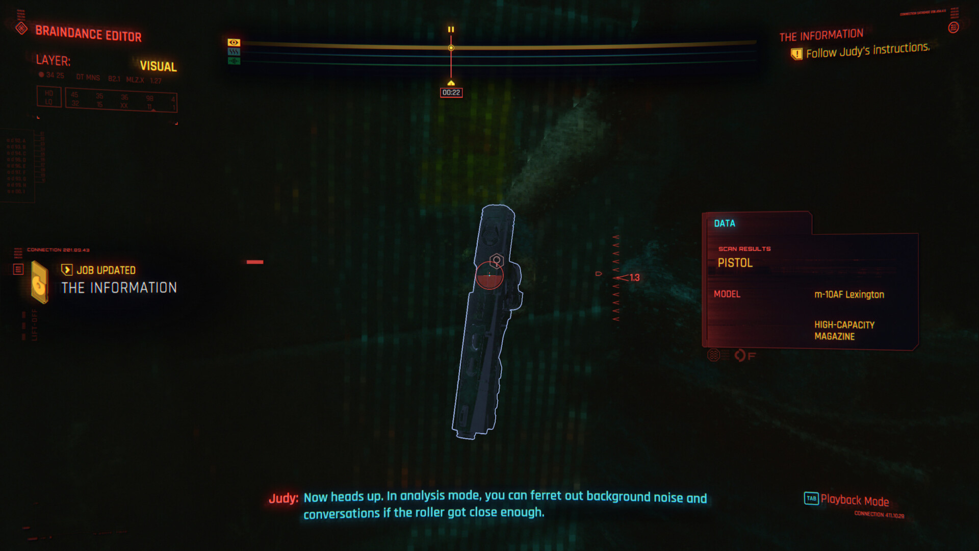
Brain Dance interface
Mechanically, the game often stands complacently on the shoulders of those before it. One mechanic, however, stood out to me. ‘Brain Dances’ were an innovative way of exploring narrative and playing detective.
A timeline style interface scrubs through a previously recorded event in VR, letting the player dig into a situation and uncover clues — a concept that suits both the gameplay and the Cyberpunk fiction. Brain Dance sequences were spaced well enough throughout the story to avoid becoming tiresome or under-utilised.
So, overall there are plenty of strong elements in play throughout Cyberpunk 2077. However, the following sections will focus on where I think improvement is needed and explore some of my own ideas to tackle it.

Immersion
Left: Deus Ex — Right: Cyberpunk 2077

Left: System Shock 2 — Right: Cyberpunk 2077
Although Cyberpunk 2077 doesn’t call itself an Immersive Sim, it certainly draws inspiration from the philosophy. At the very least, it was a place people anticipated they could lose themselves in.
A commonly thrown around term, “immersion” might commonly be equated to realism; convincing environments, quality voice acting, advanced animations, lifelike characters, etc.
I think these are part of the puzzle and can definitely contribute — but graphical fidelity is not a guarantee, nor a requirement. For me, immersion is more about feeling like you exist that world, and not about being tricked into believing that it’s real.


Left: Metro Exodus — Middle: Neo Scavenger — Right: Red Dead Redemption 2
Case in point: I found Metro Exodus and Neo Scavenger to be equally and impressively immersive. Red Dead Redemption 2, on the other hand, left me feeling completely the opposite. Neo Scavenger may be crude and pixellated, but it was other aspects of the design that gave life to the experience.
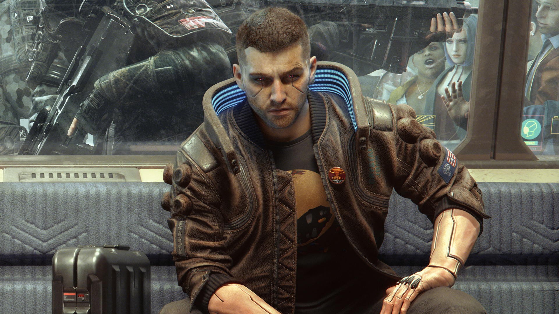
Visually — if you’ve got the hardware — Cyberpunk 2077 looks stunning; one of the most aesthetically impressive game worlds I’ve seen. Main characters possess genuine depth and were mostly performed well (the exception being Johnny Silverhand, who was made out of wood). A gripping storyline connected me with those characters and helped define the main quest line.
It’s a world that could be so absorbing. So what was it that held it back?
1. Way-finding
Throughout Cyberpunk 2077, many of the interface-related barriers to immersion fit under the umbrella of ‘way-finding’; the ways in which the game tells me where to go and how to get there.
A glaring issue was the number of missed opportunities to leverage the cybernetic theme through diegetic or augmented UI. An overload of quest markers felt like a cop-out that wouldn’t leave me alone, fighting for attention alongside a mini-map that really doesn’t want you to take your eyes off that top right corner.
This section is separated into the following:
- Quest Markers
- Main Map
- Icon Overload
- Fast Travel
- Driving
1.1 Quest Markers: distracting and hand-holding
Floating markers are a common staple in games, and not necessarily a bad one if used correctly (and sparingly). Standing around wondering “what am I supposed to do?” isn’t fun.
Unfortunately the design of this one is far too exaggerated, and the concept is overused for minor objectives that shouldn’t need to be telegraphed through UI.
Imagine developing one of the most artistically impressive video game worlds ever created, and then making players unable to focus on anything other than this incessant blinking.
As well as just being a visual distraction, I also feel this really detracts from one of the main selling points of the game: missions can be tackled your way, based on your play style.
For example: the yellow icon will point you straight to the main entrance of a building, actively discouraging any creativity in how this is approached — such as bypassing the front door altogether. Perhaps the player’s skill set would be better used to climb the roof and sneak through a window? Or stealthily dispatch a body guard and hack their way in through the back?
If the enemies weren’t marked with these glowing yellow icons, the guy in the shadows might have actually taken me by surprise and created an exciting moment of combat.
Alternative routes may reward the player by finding hidden loot or secrets, avoiding detection, or just not having to pay the entry fee for a night club. Instead, the game encourages you to sleepwalk through quests, blindly obeying the yellow circle.
I understand the need to give some direction to clarify objectives, especially in such a large mainstream game with a wide variety of content. It just needs to be more tactful; objective icons don’t need to be quite so eye catching and ever-present. The style of animation used is something I would normally reserve for a more urgent and less permanent warning.
As well as the visual headache, the implementation feels disappointingly limited. V is equipped with cybernetic optics that they can use to scan their surroundings. Surely this is a wasted opportunity for a more thematically creative representation?
How would I fix this?
I’ve collected a few thoughts below on how games can help the player find their way.
Can objectives be telegraphed through clever design?
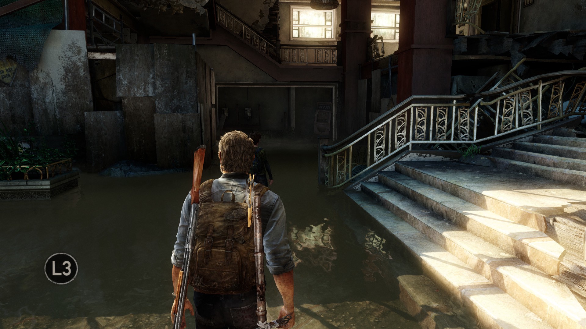
Level Design directs players in The Last of Us. Strong lighting illuminates the path, combined with the eye-catching colour and movement of the yellow caution tape
Level Design can direct players using signifiers in the environment (subconscious in-world waypoints such as light flooding an open door, a large landmark in the distance, or more literal directions like arrows and signposts).
Contrast is an extremely powerful component for leading the player, and can be created with different techniques such as light, shape, colour or even composition.
Can direction be given organically?
Notes, voice logs, or other mission clues can guide the player through more organic and rewarding exploration by encouraging them to pay attention to clues in their surroundings. Getting directions from an NPC, finding a note with a hand drawn map or hacking a computer to download the location of a hidden stash, for example.


Left: In Fallout 3 clues and direction could be found in voice logs, notes, computers, talking to NPCs, etc. (Credit)Right:The Last of Us: Part II placed information in the environment that the player could use to guide them through a level.


Left: Deus Ex might give you a map for a certain objective, but it’s just a static satellite image and it’s up to the player to orient themselves using landmarks. (Credit) Right: In Prey these hand drawn maps were used as more difficult secrets, to hint at an objective’s location.
To help the player keep track, these findings could still be logged and easily referenced using their journal.
If more literal and versatile directions are needed, If more literal and versatile directions are needed, is a compass a better alternative?
No Man’s Sky can potentially have a huge number of markers the player is tracking. The compass helps minimise the clutter created.
Could Cyberpunk 2077 have used an on screen compass to achieve the same job of the mini-map and quest markers but in a less intrusive way?
God of War’s minimal compass barely intrudes on the screen


Left: BioShock, Right: Metro Exodus
- God of War used a very minimal compass to help clarify the location of objectives. It helped keep the player’s view clear but offered a fallback if they ever did feel lost.
- BioShock simply pointed the player in the rough direction of their objective with a single arrow. This works well when the player only has one objective, and I like the minimalism of it, although it’s sometimes a little too easy to look at it too often.
- In Metro Exodus, a literal compass on Artyom’s wrist would point to his objective at all times.
Although it would be ideal to never need to hold the player’s hand at all, that isn’t feasible for all games or all audiences.
A compass is a nice balance of accessibility that still encourages the player to concentrate on the environment and think for themselves. It minimises artificial on-screen UI but doesn’t obfuscate information.
Could objectives be highlighted while scanning?
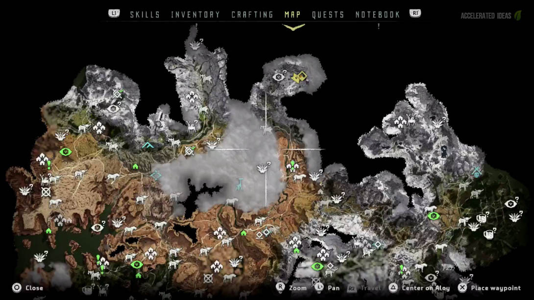
Aloy using her Focus Device to highlight information on an enemy
Detection modes can be overused or feel crowbar’ed into a narrative, and I think the criticism is often fair.
Horizon Zero Dawn is an example that, in my opinion, recognised the criticisms of this mechanic and utilised it effectively:
- It ties seamlessly into the fiction through the use of Aloy’s “Focus” device.
- It doesn’t completely obscure the environment so the player can still appreciate their surroundings.
- Movement is slowed so the player can’t rely on it all the time.
- Provides strategic information for the player to use (highlighting weak points or patrol paths), rather than making things too easy.
Cyberpunk 2077 could be a good candidate, already utilising a similar feature for hacking. This could be leveraged sparingly to highlight objectives, if the player struggles to find them through more organic methods.
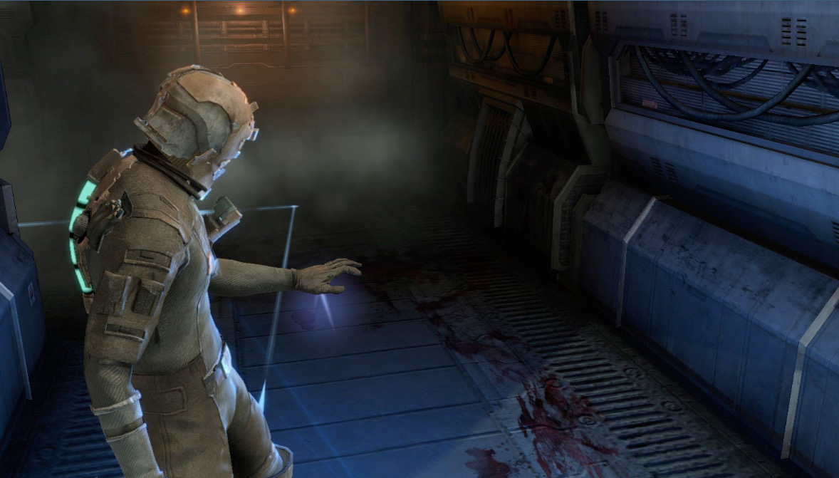
Projecting a guiding line in Dead Space
While in this mode, perhaps the paths towards those objectives could be projected in AR, such as in Dead Space?
This type of navigation aid borders dangerously closely to overbearing markers like Fable’s golden trail, but worked well in Dead Space due to it‘s activation being limited. It wasn’t possible to walk around while using it, so the player couldn’t be tempted to always use it.
When all else fails, could opt-in hints provide a safety net?
L3 occasionally prompts the player to ask for a hint if they need it
A combination of other design techniques could mean it’s safe to rely on the player’s ability to find things most of the time.
Naughty Dog are extremely good at telling the player where to go using psychology and design. However, as a fail safe (and for better accessibility or control over difficulty) the player can still opt-in to hints if they do get stuck.
Although this doesn’t solve the fundamental problem, it can be used as a back-up where needed.
So, while I believe the quest marker issues stem from a deeper design problem, the least I would like to see would be surface improvements: reduce the distraction of the main quest marker, or show it in the HUD scanner only and allow the player to “mark” it to optionally keep it permanent (as when marking an enemy).
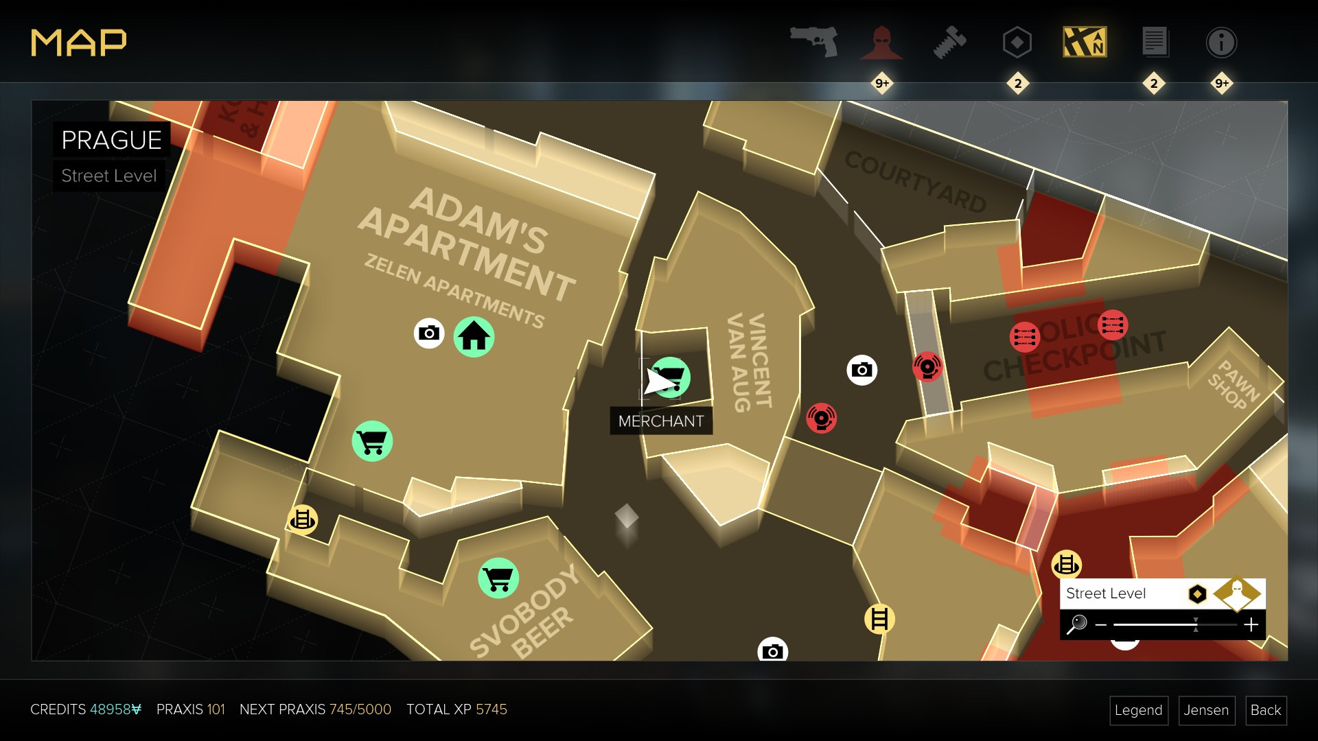
1.2 Main map — difficult to decipher, with icon overload
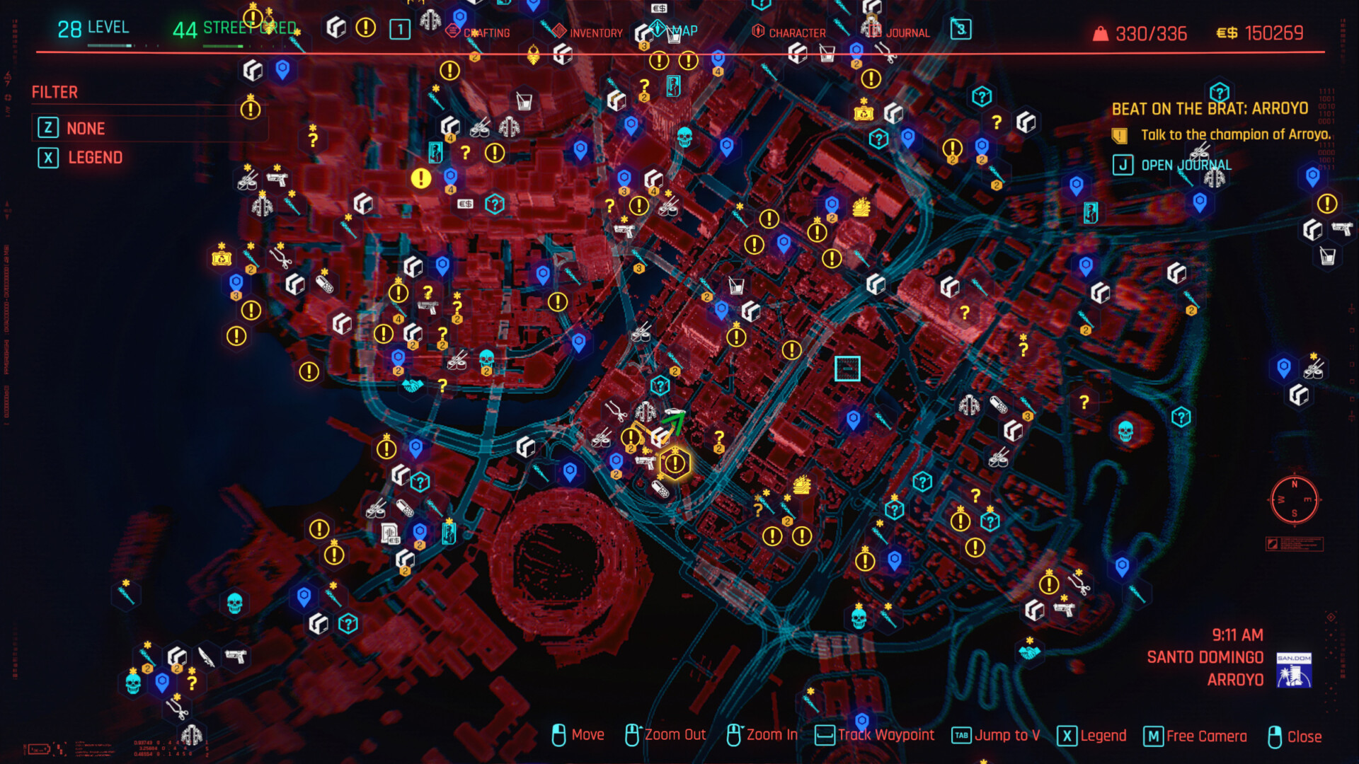
That’s a LOT of icons
Unfortunately, like many mass-market open-world games, Cyberpunk 2077 suffers from the familiar sight of a map overloaded with icons and no reason to care about any of them.
Smeared with a dark red, the style and colour choices of the map feel unappealing compared to the ultra stylish aesthetic everywhere else in the game. Bright yellows and blues contrast well against the background, but the fuzzy red feels jarring and — aesthetics aside — it’s not useful. Tall buildings give a decent 3D representation of the world, but useable paths and roads are frequently obscured. (The ‘free camera’ feature doesn’t help, as it removes other information while you use it).

Perhaps some information could still be shown on the map but in a more creative way, such as heat maps to highlight crime or gang activity? (Img Source)
That monochromatic red of Cyberpunk 2077 also fails to communicate the variety between different zones.
Horizon Zero Dawn
lthough Horizon Zero Dawn may be plagued by a similar icon disease, the rendering of the world is much more pleasant to look at — as well as being useful. An aerial 3D view makes for a nice visual, clearly showcasing the contours of the terrain as well as the variance in biomes.
Deus Ex: Mankind Divided
On the simpler end of the spectrum, Deus Ex: Mankind Divided gives clarity at street level. Clear contrast combined with a slight perspective to communicate the depth of buildings works well here.
Icon Overload
Returning to the problem of icon overload, it’s a pity when such impressive open world games are reduced to glorified checklists found in the Map screen.
Game, Map or Level Design might play a role here as well as UX/UI. But these problems manifest as interface elements at the end of the day, even if they are the result of decisions made elsewhere.
For Cyberpunk 2077, it seems CDPR took notes from Assassins Creed, but I’d rather they’d drawn inspiration from Zelda: Breath of the Wild.
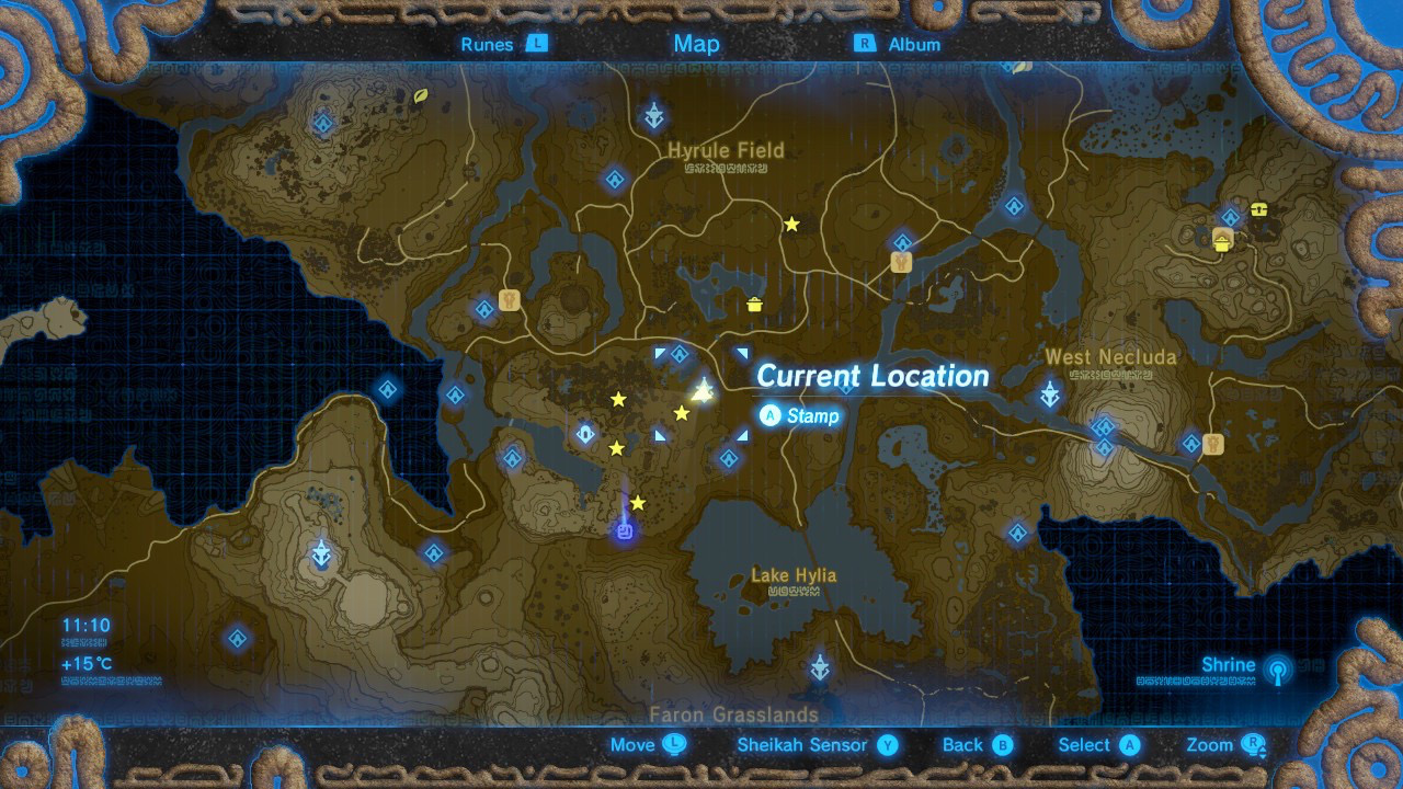
Zelda: Breath of the Wild
Nintendo still made use of both a main map and a mini-map. It even borrowed notorious Ubisoft tropes such as climbing a tower to reveal areas (e.g. Far Cry 3). On paper, it sounds bad. However, a restrained approach coupled with intelligent environment design resulted in a more successful result, despite the similar ingredients.


- Points of interest and geographical locations create clear landmarks in the environment, reducing the need to consult the map for everything.
- Fast travel must be unlocked by first visiting each place, providing a balance between exploration and quality-of-life.
- Secrets are actually secret — not every collectible or point of interest is exhaustively revealed by default, the player finds them naturally through exploration — this minimises the amount of icons shown.
- Visual design of the map makes roads and contours clear with obvious contrast.
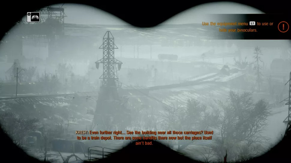
Using the Binoculars in Metro Exodus to scout locations
I also believe Cyberpunk 2077 could have learned some lessons from Metro Exodus, which transitioned very well from the linear experience of the earlier titles to an immersive open world.
While exploring the landscape, the player would identify points of interest using their binoculars. Various high points in the game would naturally encourage the player to take in their surroundings at each area.
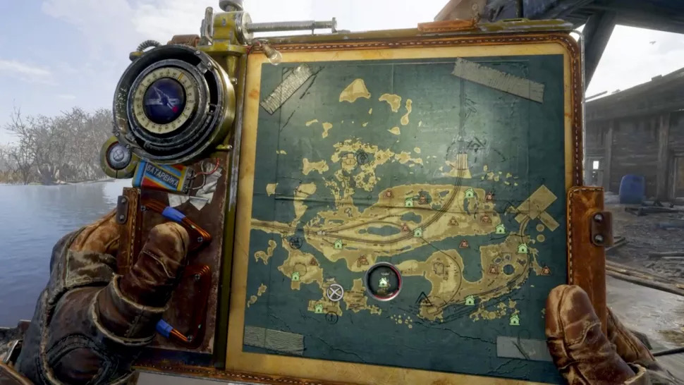
Artyom’s Journal is a diegetic interface element providing key information
As points were noted via the binoculars, Artyom would mark these on his map as question marks to discover. Once the player physically visited these locations, the actual icons would be revealed (e.g. a Bandit Camp, Monster Nest or Safe House).
Personally, I felt this execution was perfect for the type of game that Metro Exodus is. Evidently, there is huge potential in smaller but more meaningful open worlds. In my play-through, this resulted in that:
- I felt more immersed in the world because I was actually discovering it in a plausible way.
- My sense of direction was much stronger, because I had observed the area using my binoculars and actively learned the geography.
- I didn’t feel overwhelmed by the amount of POIs on the map, because they were disclosed gradually (and there were simply less of them — but it’s not that the world was more empty, it’s just that not every single object needs an icon).
- I was actually attentive and appreciative of the surroundings, unperturbed by quest markers, mini maps or other HUD elements.
- The world felt real and alive, because it continued to exist around me while I checked my map or used the binoculars (thanks to the diegetic map and compass). Considering the game has survival horror elements, this built tension. Rather than being pulled out of the experience, checking the map actually became an emotive piece of the experience.
- Overall, I still didn’t get lost or wander aimlessly. Checking my location or hunting for the next area to explore was simply done by briefly pulling the map out if I did need to.
Of course, Metro Exodus and Breath of the Wild are both very different games to Cyberpunk 2077. What applies to one may not necessarily translate to the other. Exodus is still a relatively linear experience, and Breath of the Wild only has to concern itself with expansive outdoor areas rather than dense and vertical cities. I do believe, though, that Cyberpunk 2077 could have at least borrowed ingredients from these successful recipes, rather than resting on tired conventions as much as it did.
If anything, it’s simply a shame — years of development and artistic talent created some beautiful sights, yet the game removes any reason to look at them.
1.3 Fast Travel — efficiency vs. adventure
Many players would consider fast travel a necessity. I’d generally consider it a necessary evil.
In Cyberpunk 2077, I felt it was overly simplified and discouraged discovery or adventure.
Players can essentially teleport between any two locations instantly. Granted, they must visit one of the terminals dotted around the world first — but there are so many of them it might as well just be a button on the map screen.
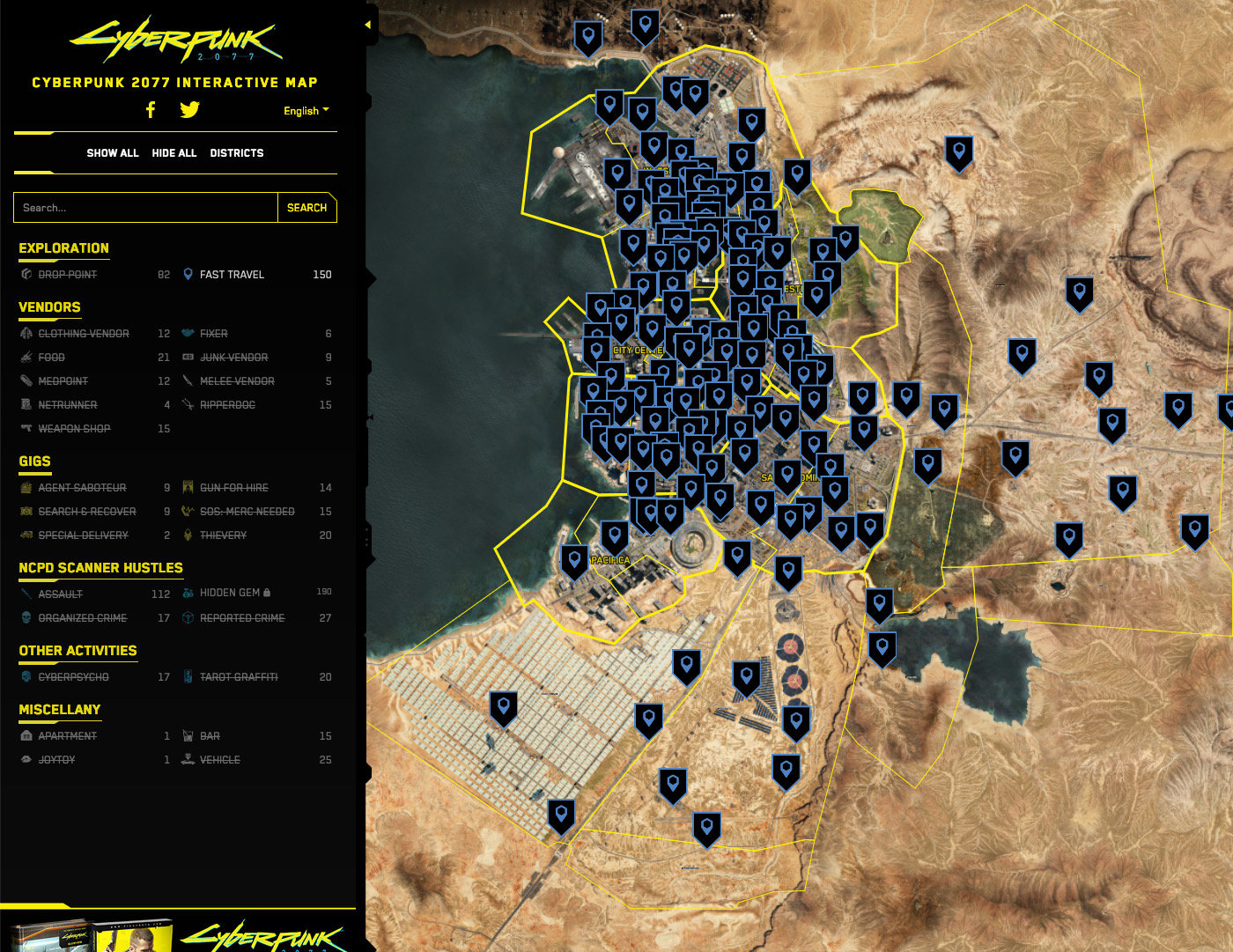
Fast Travel terminals aren’t exactly few and far between. From the official web map for Cyberpunk 2077.
What’s the point of an open world, if the player never needs to traverse any of it? While too little efficiency creates monotony in a game, too much of it stamps out the fun.
I understand many players don’t have the time nor inclination to drive or walk between every quest, but there must be a compromise here. After giving it some thought, my takeaway is this: mitigate the need for fast travel in the first place, while still allowing a more restrained implementation of it.


Why fast travel when you can do this?
Firstly, incentivise manual travel:
- Make movement enjoyable. Using the glider, climbing or shield surfing was fun in Zelda: BOTW. Swinging through the city was fun in Spider-Man. A variety of transport options can give players more options for different scenarios (a motorbike in the city vs a helicopter between regions).
- Entice players to explore by foot by packing the world with reasons to see it. Secrets, random encounters, unlisted side quests, etc that would otherwise be missed through fast travel.
Traveling via the Metro system in Deus Ex: Mankind Divided
Secondly, restrain fast travel so it’s efficient but not overpowered:
- Spread fast travel points more sparingly, such as major hubs that the player is most likely to travel between frequently (e.g. their Apartment in Cyberpunk 2077 or the location of major quest lines)
- Require the player to visit (and possibly interact with) a fast travel point to activate it
- Introduce a more plausible travel system depending on the game — a horse and cart, taxi, or metro system, for example. This also justifies the stops being fewer and further apart.
(Source)
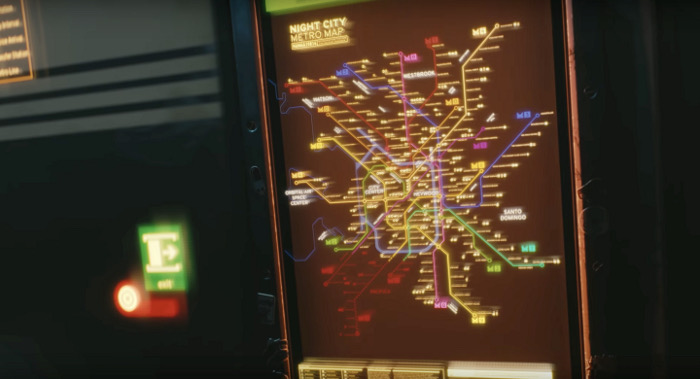
Pre-launch trailers and unfinished parts of the map suggest that fast travel originally would take place via a monorail system in Cyberpunk 2077. Whether this was a gameplay decision or another cut corner, I would be curious to know.
I won’t be surprised if many players and designers disagree with me. I can see how making fast travel less efficient could be a questionable idea, but I think games like Zelda: Breath of the Wild are a great example of giving the player efficiency while rarely making them require it.
1.4 Driving — another missed opportunity
So far, one of my favourite activities in Cyberpunk isn’t the shooting or the hacking — it’s actually driving (which worked out pretty well based on the previous section about how I don’t like to use fast travel). A motorbike was possibly the best addition to my arsenal, and high octane trips through the city can be a lot of fun.
There’s just one let down…
In a game about cybernetic enhancements that can literally give the user a customisable HUD, why aren’t driving directions projected into the world through augmented reality?
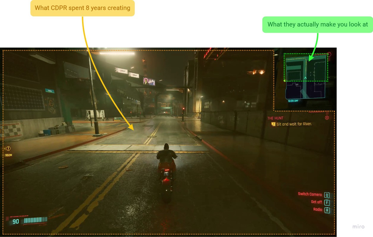
Instead, the game relies on the small mini-map in the top right of the screen for directions. This has the following problems:
When driving, my eyes are always in the corner of the screen. Not only do I miss out on the environment, I struggle to watch out for other vehicles or people (which can put an abrupt end to fun).
You’re moving so fast that the mini-map isn’t even useful. By the time you see the turn you need to take, it’s too late. It doesn’t work like a real-world sat nav, because:
- The arrow is positioned in the center, so there is less awareness of what’s ahead of you
- The zoom level is too close and doesn’t adapt to your speed
- You’re moving a lot faster than any sane person normally would in a busy city
- Sat Navs generally give verbal instruction ahead of time
Most real-world navigation UIs would position the arrow in the lower third of the screen, to give more visibility on what’s coming up. A low angle or perspective might also help give a better view. (Image Source)


(Left) Come on, it’s the future. We don’t need sat navs. (Right) Maybe some lessons from racing games like The Crew?
The interesting thing is, I don’t believe that CDPR simply never thought of this. It feels like they chose not to do it (due to cost, or opposition to the concept — I don’t know). In fact, there’s even a hint of it in the game already.


Left: This excerpt from a cutscene shows yellow AR-style markings projected onto the environment. Right: This side-quest featured a race through the city, which actually showed yellow markings on the road and checkpoint gates.
So, not only is the tech at least somewhat feasible from a development perspective, it also fits perfectly into the fiction of the game and could be implemented 100% diegetically and contextually.
This is one of the biggest disappointments I encountered. As much as I loved driving, it could have been so much better with the addition of more immersive and usable way-finding.
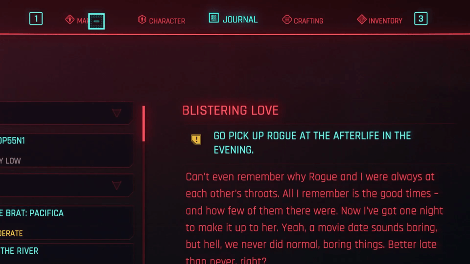
2. Shards are same-y
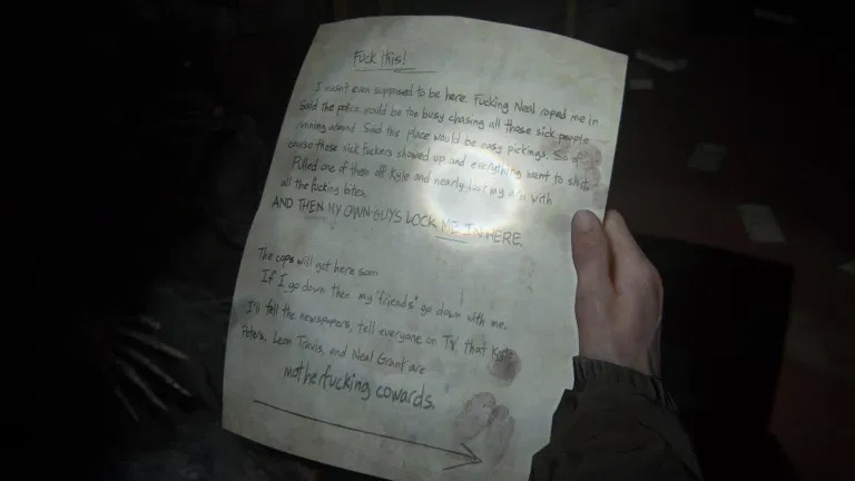
In many games I personally enjoy reading the lore scattered around, normally through various world building devices that tell stories about the universe and its inhabitants. Handwritten notes, newspapers, journal entries, voice logs, emails, or even something written on a wall.
Found pieces of lore in TLOU: Part II were varied and engaging
Some of the most memorable examples of these I found in games like The Last of Us II, where stories between characters would be told throughout.
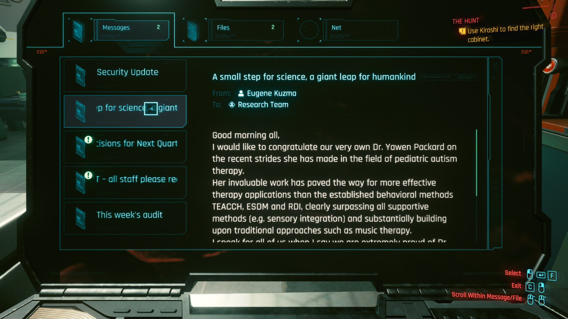
Emails and Computer Files often hide some interesting story details amongst the futuristic spam
Unfortunately, Cyberpunk 2077 doesn’t utilise these as well as other games before it. The written content is in there — and I’m sure it carries compelling tales — but the format doesn’t encourage engagement for me, at least not beyond the first few hours.
Snippets come in two formats: Emails or files on a computer, and ‘Shards’ (which are essentially a futuristic PDA).
All Shards share this yellow icon, there is no visual distinction between types of content


All shards share this boring blue UI, and unique conversations blend in with the longer more generic readables.
Despite potentially containing two quite different types of content, Shards always look exactly the same — the in-world object, UI icon, and the reading interface are identical.
Some contain longer excerpts from in-game publications. Others contain unique conversations between characters.
To me, the latter is much more interesting. I would like to unravel more information about the smaller stories between people in Night City. At first I would collect all of the shards I saw, but stopped once I realised it was a lucky dip on whether it would be an intriguing story piece or just the same book excerpt I’d already read.


Different types of readable lore or background stories in Deus Ex: Mankind Divided
In contrast, Deus Ex: Mankind Divided serves up a clearer language to separate types of information and it’s easy to only engage with what interests you.
- More ‘global’ lore was stored in Websites, Newspapers and Magazines.
- Personal conversations were found in Emails and Pocket Secretaries.
- Books were found on glass e-books.
Both the in-game 3D models and the accompanying UI gives them clearer signifiers, more personality, and an anchor to the world of Deus Ex.
In Cyberpunk 2077, from the outside I can’t really tell if I care enough to pick one up. Not only that, but people in Night City do use paper. Books and magazines are shown in many apartments, so why isn’t the medium utilised for collectible lore?
This could be an over-analysis of something players might happily ignore. But for a developer who are lauded for their powerful side stories and promised a living world full of individuals, it would have been nice to see more variety and depth to how storytelling and world-building was threaded throughout.

Efficiency
This second half focuses more on classic UX elements, such as how menus are laid out and how effectively the player is able to get things done.
1. General Navigation
The tabbed navigation can feel confusing. While playing my way through the menus of Cyberpunk 2077, I kept coming back to one overall sensation — that of being… lost. The path from A to B never felt simple, I’d often take a couple of tries to find the area I had in my head.
On reflection, there are a few design decisions contributing to this overall problem.
1.1 Carousel behaviour is disorientating and unnatural for top tabs
Stop the ride, I want to get off!!
The position of something on a screen is an effective tool for memorisation. People remember the rough location of something in a space much easier than precise facts about it. If you lose your page in a book, you’ll likely remember which area on a page you’d read up to — but not the page or chapter number.
That’s why it’s a questionable idea to make key navigation buttons jump around constantly, giving the player no hope of relying on their spatial memory to quickly find them. As summarised by the Nielsen Norman Group:
“Spatial memory is bolstered through repeated use of spatially stable interfaces and can reduce the amount of cognitive effort needed to find key features or content.”
In most games I’ll have memorised the position of key buttons after a couple of hours, and the flow through the structure becomes subconscious. With Cyberpunk 2077, however, I feel like I’m the victim of a cheesy magic trick where the game hides my Inventory under a cup and shuffles it around.
Luckily, the fix is simple — stick to familiar interaction patterns with navigation buttons in set positions, regardless of which is active.
1.2 Naming becomes ambiguous
I often find myself clicking on ‘Character’ when I actually wanted ‘Inventory’, or vice versa.
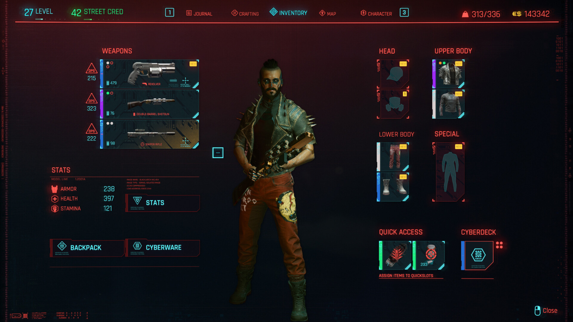
Thought this was your ‘Character’ screen? No. This is your Inventory. Thought you’d be able to see a list of the items you’re carrying in your Inventory? Wrong again. That would be the backpack!
I’d say this is firstly down to nomenclature, but worsened by the fact that the ‘Inventory’ actually shows a picture of your character yet the ‘Character’ screen doesn’t. (Well, at first it doesn’t, only if you click ‘Stats’ once you’re there. This adds to the confusion.)
Although this is actually called your ‘Inventory’, the items you’re carrying are still one step away in the similarly named ‘Backpack’.
Cyberpunk 2077’s Character Screen
This is the ‘Character’ screen. To be fair, in the vein of classic RPGs — to which Cyberpunk 2077 owes it’s source material — it makes sense that your skills and stats would be under the heading of ‘Character’.
However when applied in the context of this game and considering the other adjacent menus, it ends up confusing.
Simply swapping a few names around could be an easy fix. Instead of ‘Inventory’, I’d suggest ‘Gear’ or ‘Equipment’. Instead of ‘Character’, maybe ‘Skills’ or ‘Attributes’?
(Source)
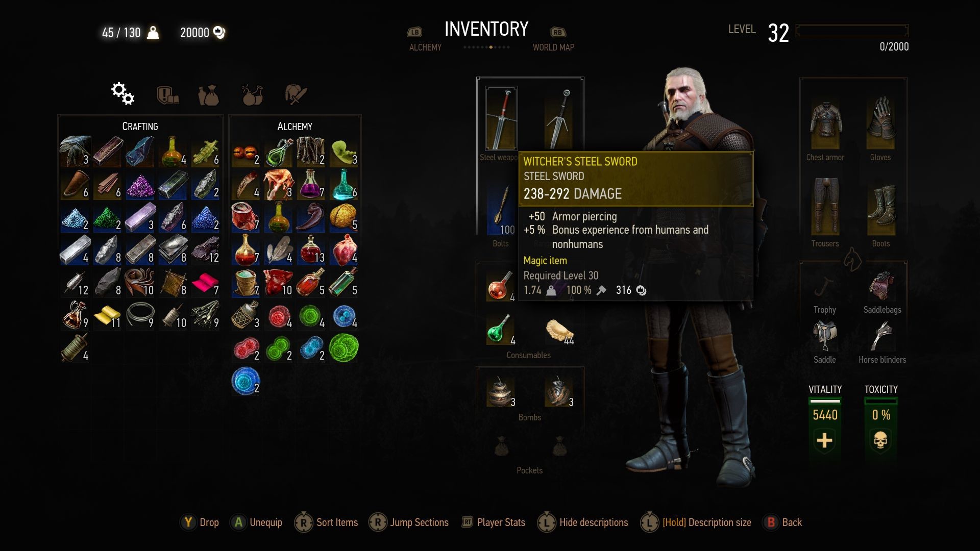
Interestingly, The Witcher 3 used almost exactly the same naming system, but I didn’t encounter the same problem.
Pinpointing exactly why is difficult, but the first thing that comes to mind is that the Inventory grid is a prominent focus and shown immediately on the top level. This helps the screen feel more immediately recognisable as an Inventory.
Alternatively, it may simply be because I played TW3 using a controller, so I always tabbed through the menu one by one without really looking at the heading — just scrolling until I saw the thing I wanted.
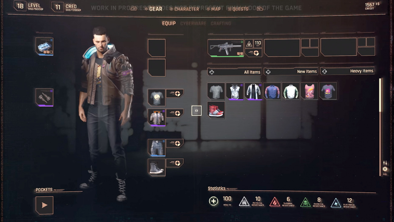
Pre-release footage of early interface designs
After digging through some old pre-release footage, I found that the ‘Inventory’ screen of Cyberpunk did used to be called ‘Gear’ and used to include your backpack in a grid on the right.
I can only speculate on why this changed, but it suggests they had a good reason and I’m assuming that testing led them away from it. Loot is abundant, so perhaps they wanted more space to show the Inventory? Or maybe the amount of interactions was too overwhelming for a single screen?
Either way it’s a shame — from an outside perspective, the old design seems stronger. I like the idea of having a clearer relationship between my equipped gear and my Inventory, without having to swap between areas to see them both.
1.3 Top tabs lack usable breadcrumbs
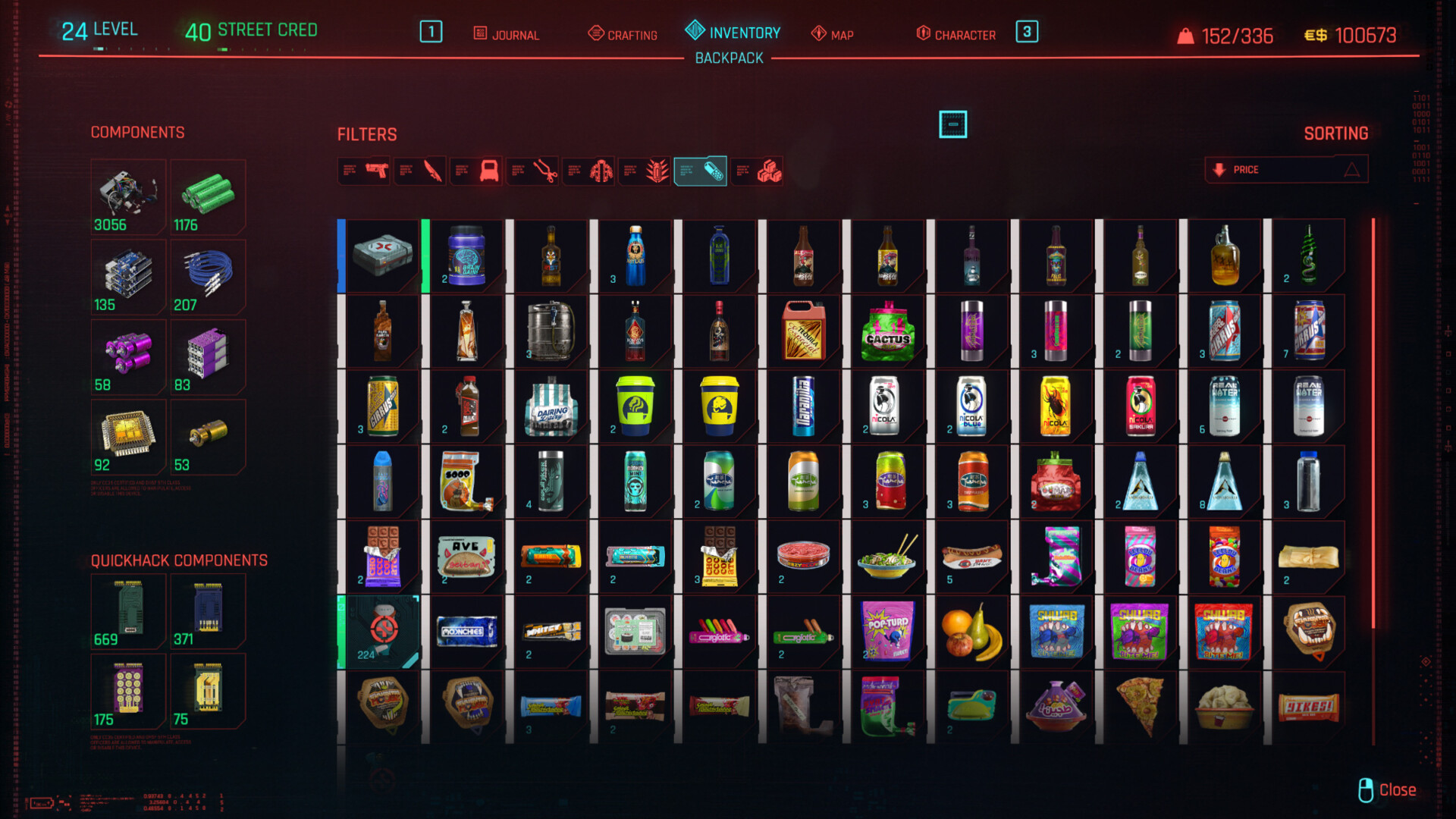
Consumables in the Inventory
Occasionally these menus take the player a couple of levels deep. For example, Inventory > Backpack, or Inventory > Cyberware. This is somewhat signposted by a subheading that appears below the tab bar, but the odd alignment and inability to click the primary heading to go back sometimes makes me feel stuck.
This would seem like a minor issue, since you can always just press the ‘Back’ button. However, the amount of times I’ve tried to click the menu heading instead suggests a small fix wouldn’t hurt.
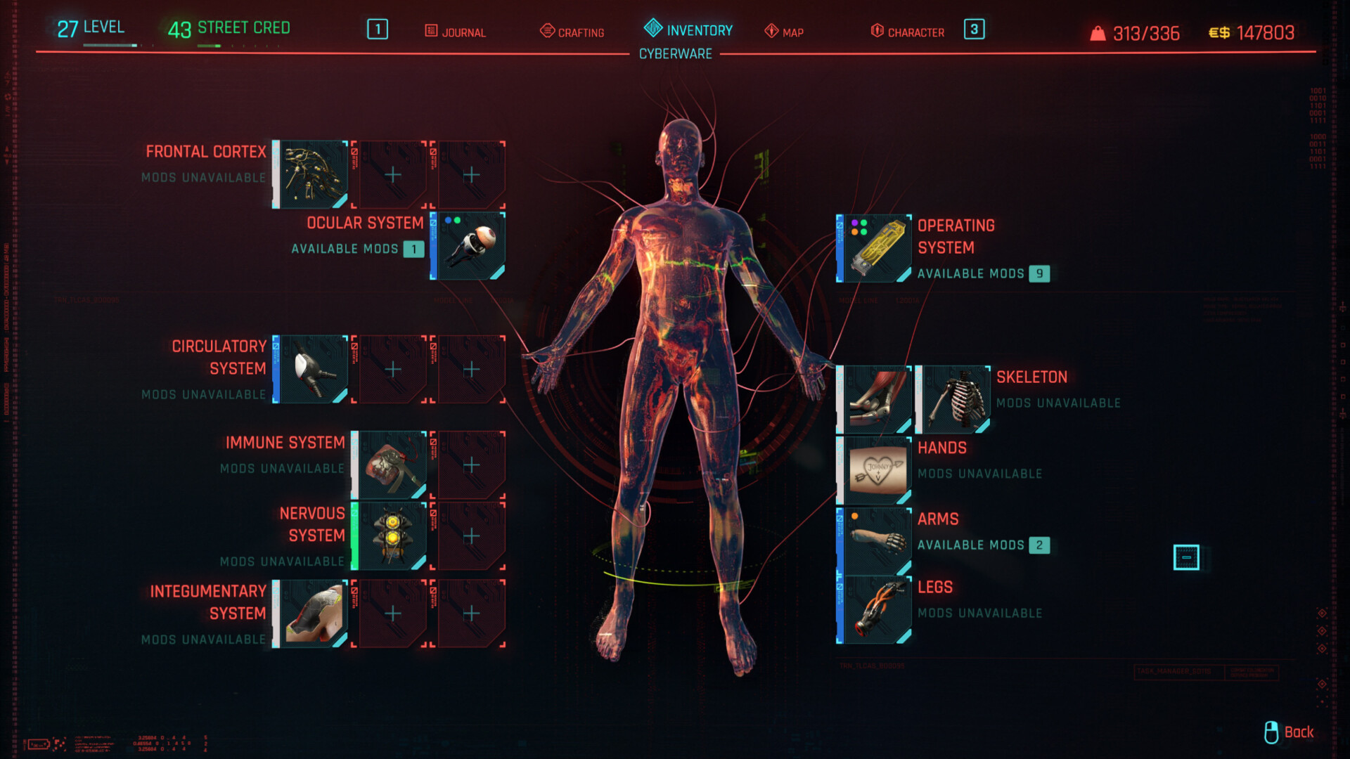
1.4 Cyberware feels oddly buried despite having two access points


The main Cyberware screen, followed by an inventory of quick hacks that can be equipped
Cyberware is a pretty huge part of the game, I would place it’s importance close to the guns and clothing you have equipped. Yet this screen feels oddly… invisible? To reach it, a player must open their Inventory tab, then navigate to Cyberware using a small button in the bottom left. Quick Hacks are buried deeper still.
The impact these mods have on your play-style really feels deserving of something more significant or discoverable.
I believe that pre-launch, it was stated that Cyberware would only be installable by visiting Ripperdocs (NPCs that fit them for you) throughout the world, so I imagine this is a byproduct of that potentially last minute change.
2. Inventory Management
I find myself spending an awful lot of time in the various inventory and equipment screens. As a fan of the Survival genre I would often consider it part of the strategy and — dare I say it — sometimes even part of the fun. When it comes to Cyberpunk 2077 however, it becomes more of a chore. The less time I spend in these menus equals more time to spend becoming wrapped up in the story or combat.
These recommendations aim to optimise the management flow for players, providing useful Quality of Life features that will help cut through the clutter and speed up decision making.
2.1 Lack of bulk actions for speedy clear outs

Playing through missions will start to build up a hoard of weapons, clothing, consumables and other items. While the game does have a bulk ‘Sell Junk’ option, there’s no way of bulk sorting every other category, such as items you want to keep and non-junk items you want to sell.
I would love to be able to quickly scan through my Inventory, decide whether an item sparks joy or not and hit a button to mark it either for ‘Keep’ (cannot be sold or discarded), ‘For Sale’ or ‘To Dismantle’. A bulk action to simply ‘Dismantle All’ (at any time) or ‘Sell All’ (while in a shop) would then make that post-mission clear out a breeze.
2.2 Long-press for Dismantling takes too long

I understand that dismantling is the type of destructive action we don’t want players to do by accident, so a long-press or “hold” action absolutely makes sense here. However, it’s way too long, and dismantling one after the other really adds up. I’d speed it up, but with the addition of a “Mark for Dismantle” option as mentioned in my previous point this might become redundant.
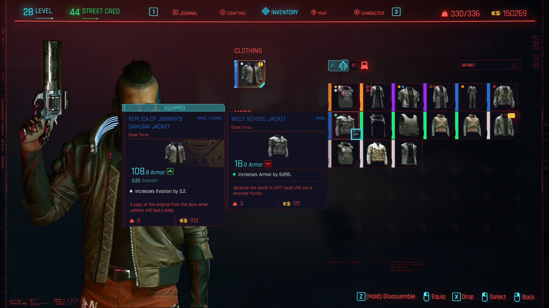
2.3 Equipped Items can get in the way
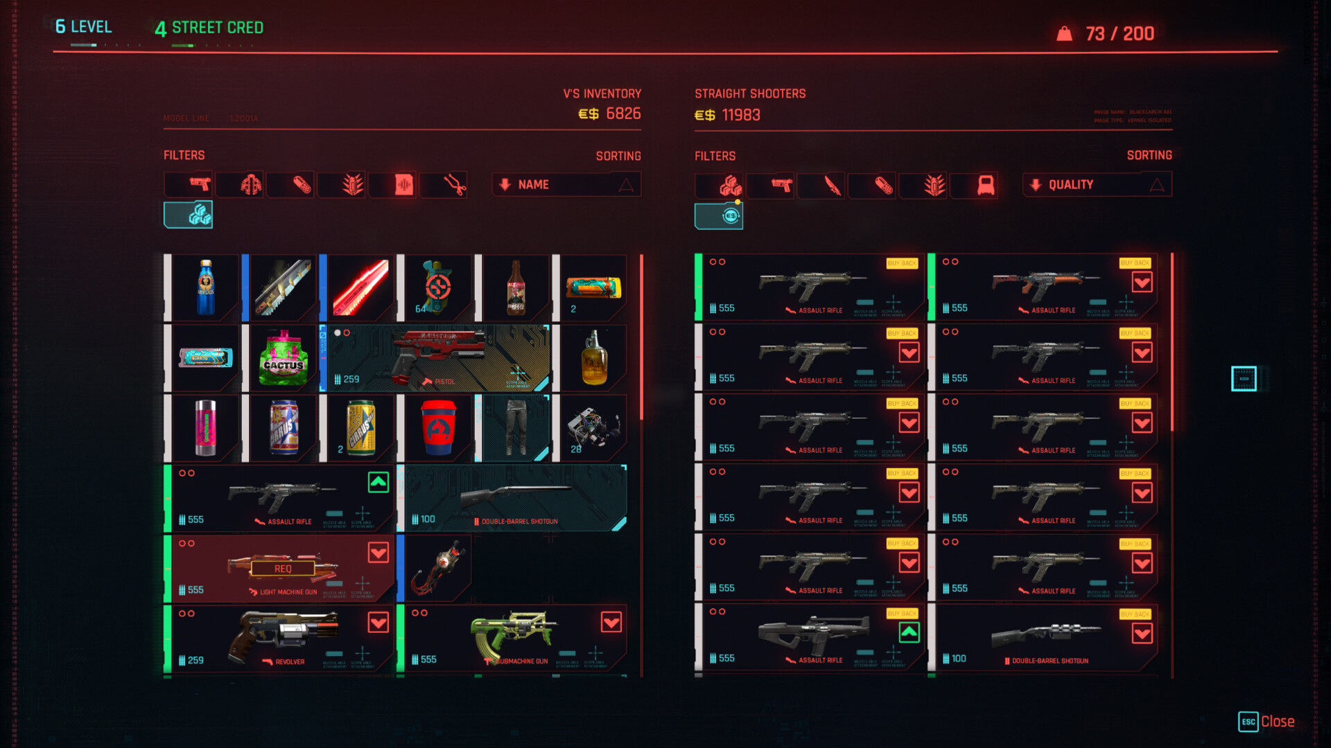
Selling equipment with Equipped weapons mixed in
A blue circuit board pattern and unique corner icon makes currently equipped items pretty easy to spot in your Inventory. However, when quickly selling and dismantling items, things constantly reshuffle and jump around in the grid.
With a bunch of equipped weapons mixed in, sometimes they can end up getting in the way as I concentrate on not accidentally ditching the wrong thing (the game warns you if you try to do this, but it’s a disruption I’d rather avoid).
It would be handy to either group together or hide equipped items, just to get them out of the way while managing other things.
2.4 Replacing equipped weapons could be clearer
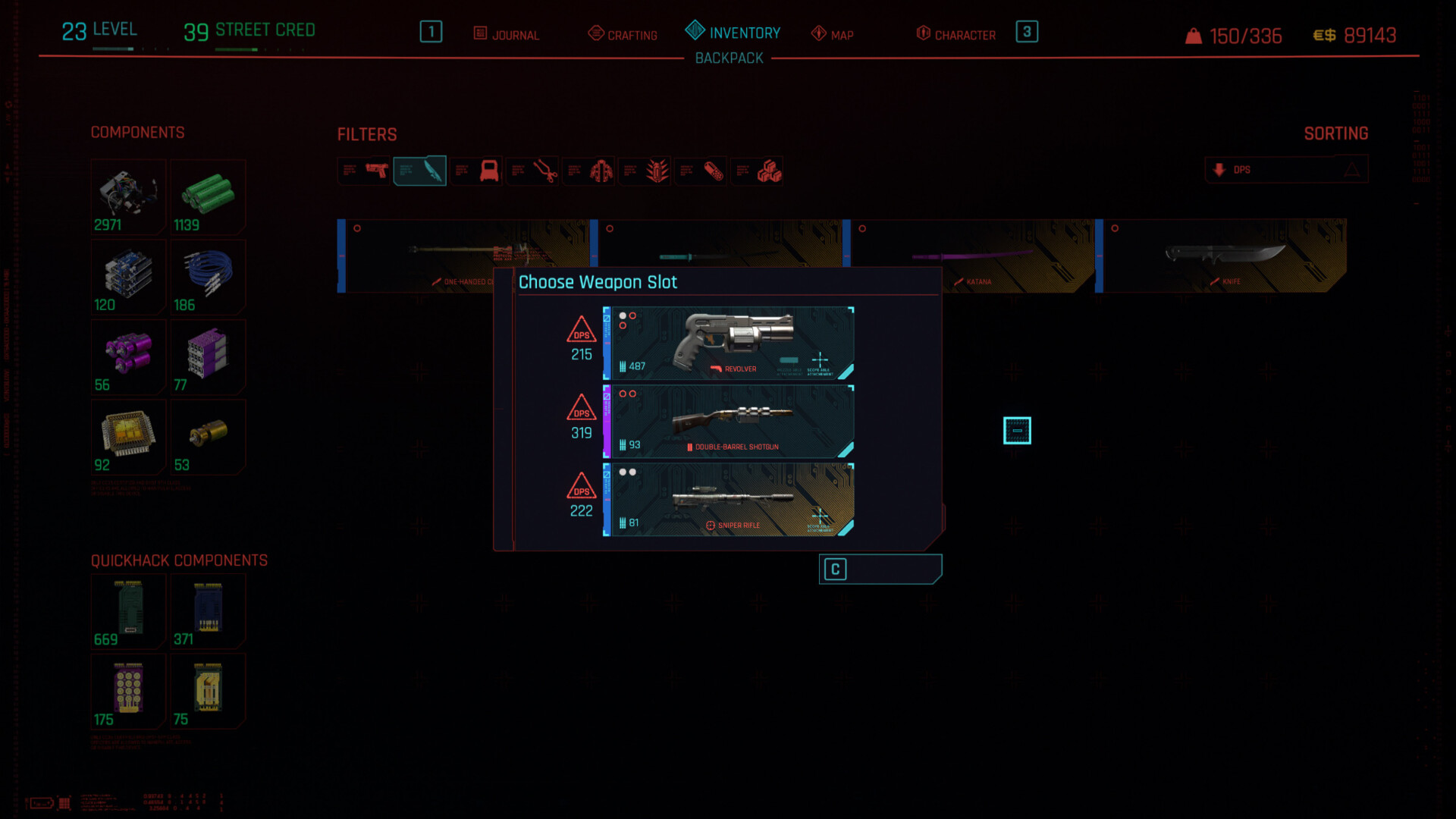
Choosing a weapon slot to replace
There are a couple of ways to replace the weapon you have equipped, which mostly make sense. Either select a weapon from your backpack and hit ‘Equip’ which will prompt you to choose a slot to overwrite if necessary, or click one of your three slots to choose a gun to replace it.
While this already works pretty well, replacing a weapon by clicking the existing slot could be clearer with the addition of a ‘Replace’ tooltip when hovering.
2.5 Selling a full stack of items takes too long
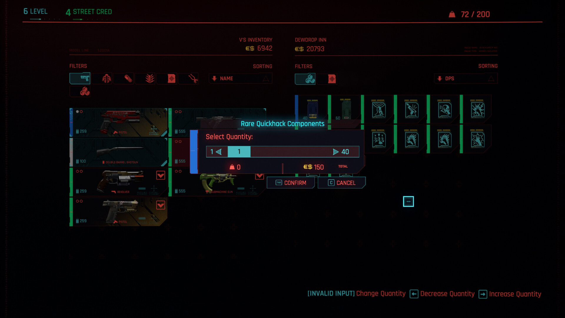
Selling a stack of components
It’s pretty common to end up with a stack of an item you don’t want, some type of consumable drink for example. Hitting ‘Sell’ on the stack brings up a clunky slider, which you then have to manually slide to the max, then press ‘Confirm’.
Doing that multiple times is a pain, but could easily be fixed by giving us a ‘Sell Stack’ button.
As well as this, the slider could potentially be at the ‘Max’ position by default. This would also make it easier if you want to sell all but one.
2.6 Meaning of the ‘Crafting Spec’ tag is unclear, looks like a button
The Crafting Specification is the subject of much speculation
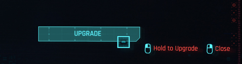
For comparison, the “Upgrade” button in the Crafting menu, which is actually a button
Some items have a ‘Crafting Spec’ tag in their info tooltip. Based on what I see elsewhere in the game, the visual language used for this label tells me that it’s a button (the lower right corner is cut off, the text is centered, the border is a bright colour with a matching fill, etc).
It’s not a button though, because it exists in a tooltip that you can’t interact with. The language used also doesn’t really make sense for a button, which would normally use a verb like ‘Equip’ ‘Craft’ or ‘View’.
Knowing that, my best guess would be it means one of the following:
- A crafting blueprint (spec) for this item exists somewhere in the world.
- You own the crafting blueprint for this item.
- You own the blueprint and the required items to craft this item.
- Dismantling the item will reward you with a crafting blueprint.
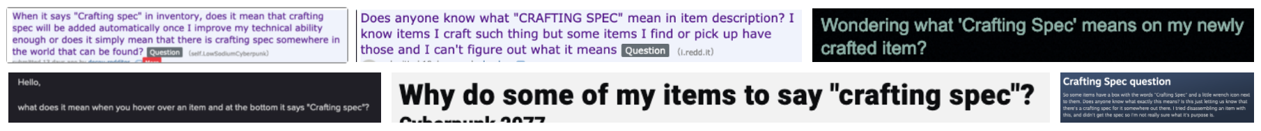
After searching online, I realised I wasn’t alone. Conflicting answers were given, so I’m not even 100% sure.
It was quite funny to see people band together to try and figure out what this thing means through research and experimentation but… isn’t it a bit sad that such a simple concept could become so… complicated?
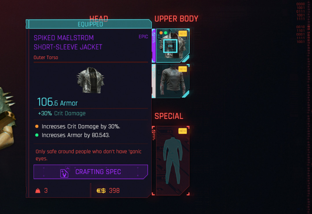
2.7 Previewing clothing uses a redundant, small thumbnail
Viewing the tooltip for an item of clothing provides a very small thumbnail
When hovering over an item of clothing, a handy preview is shown in the tooltip. Except the preview is actually exactly the same size as the icon you’re hovering over, rendering it completely pointless and not at all handy. Actually equipping the item takes a few seconds to load so it’s not feasible to just equip it to see, either.
The icon in the tooltip would benefit from being at least twice as big.
When in a clothes store, it’d also make sense to be able to actually try on items to see them on your character. Maybe they don’t have fitting rooms in the future?
2.8 ‘Sort by’ is great, but not contextual enough
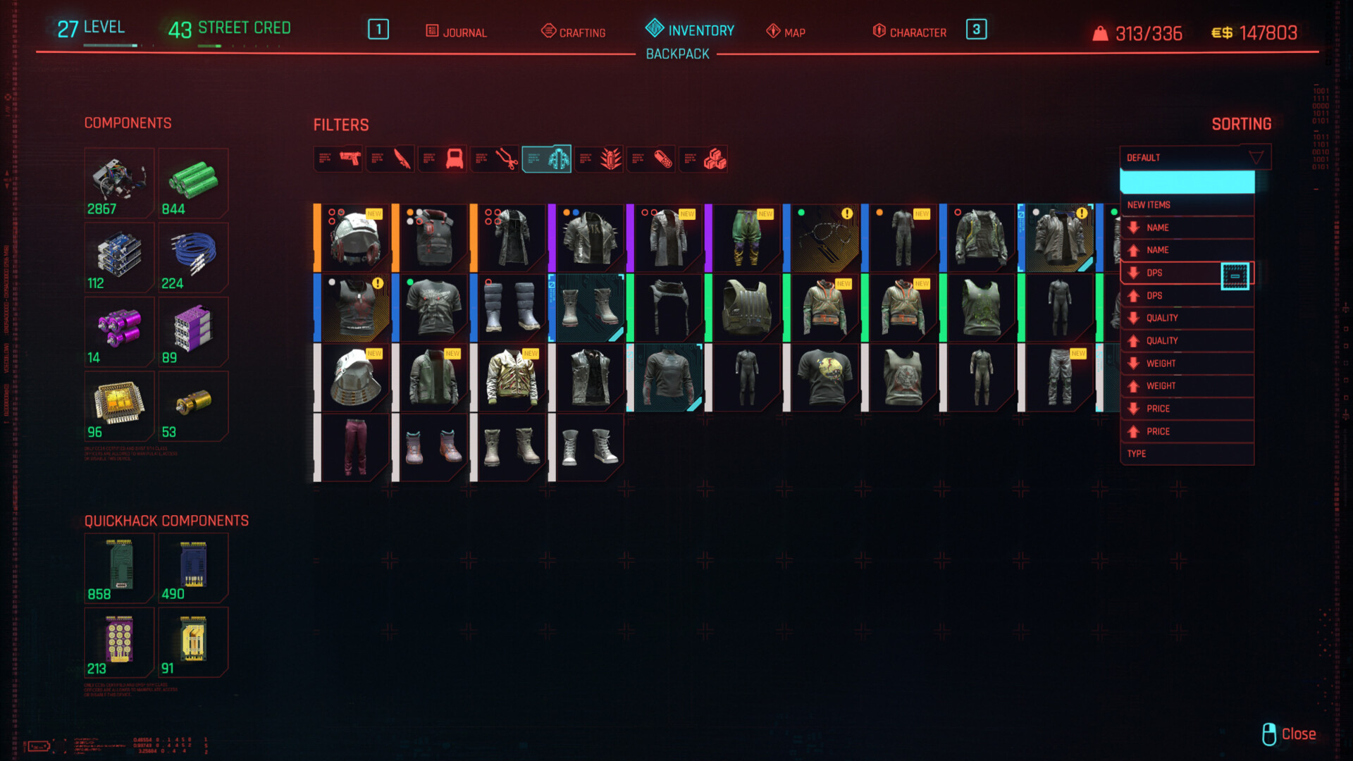
The ‘Sort By’ menu on the right let’s the player order items in their inventory
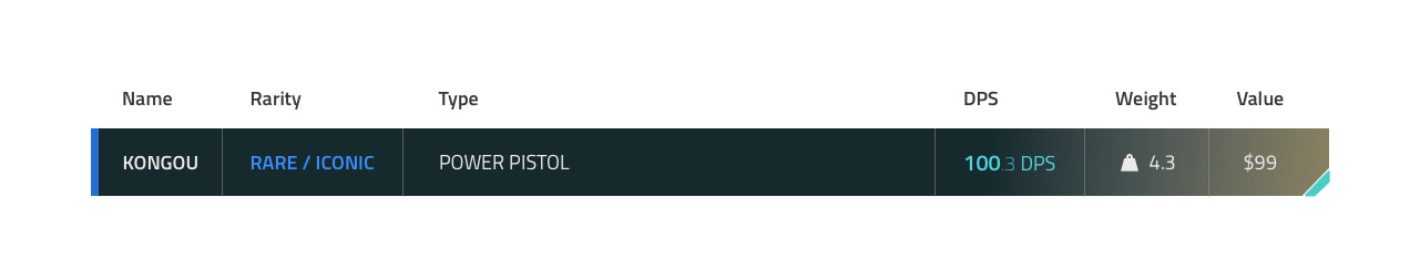
Having a ‘Sort by’ feature is a real life saver. I use it all the time to sort my weapons by DPS, Price or Weight. However, I wish it was just a little smarter, such as by letting me sort clothing by Armor value.
Instead, even when you’re filtering by Clothing only, you can still sort by DPS. Although the mental image of clothing that has a DPS value sounds very Cyberpunk, unfortunately it’s not actually a feature. Sorting by Armor would be way more useful.
2.9 Introducing different view modes could speed up stat scanning
I do think a grid view probably makes sense as the default way of browsing the Inventory — it’s easy to pinpoint a certain item, and the aforementioned Sort feature can help organise them. But sometimes I want to get a look at all the different stats at a glance, without having to hover items one-by-one.
At risk of making such a mainstream game a little too spreadsheet-y, I do think some players could benefit from being able to view a category in a list or table format.
3. Crafting
3.1 Lack of comparison
Viewing an item to be Crafted
Generally, the game does a decent job of letting the player compare items. During Crafting, though, it isn’t possible to weigh up the craftable item against any of the equipment you currently have equipped. Instead, you’d have to remember the various numbers, navigate back to your Inventory, and then come back here. It’s also not possible to directly compare between two craftable items.
This has led me to not engage with the Crafting system much at all, since it’s too much effort to try and figure out which one is the best use of my materials. This is especially alarming because I usually love crafting systems.
3.2 Crafting and Upgrades screens feel bland, lacking story
Elsewhere in the game, screens like Cyberware give me an interesting view of the theme of that area through artwork, illustration and layout.
Unfortunately, the Crafting screen just feels like the many other muddled areas of the Inventory. A set of top tabs, a grid of items, and lots of stats and information. The large gun artwork is nice, but overall the screen doesn’t really make me feel like I’m crafting anything.


Alien Isolation, Astroneer, Green Hell.


Outward, Prey, The Forest.
Games like The Forest, Green Hell and Astroneer have spoiled me. From an interaction point of view, Cyberpunk 2077 feels incredibly devoid of story.
Even if the Diegetic or Semi-Diegetic examples above are not feasible, games like Outward and Alien Isolation demonstrate how a creative use of layout and illustration can at least inject theme and identity into a menu, even if it remains simple under the surface.
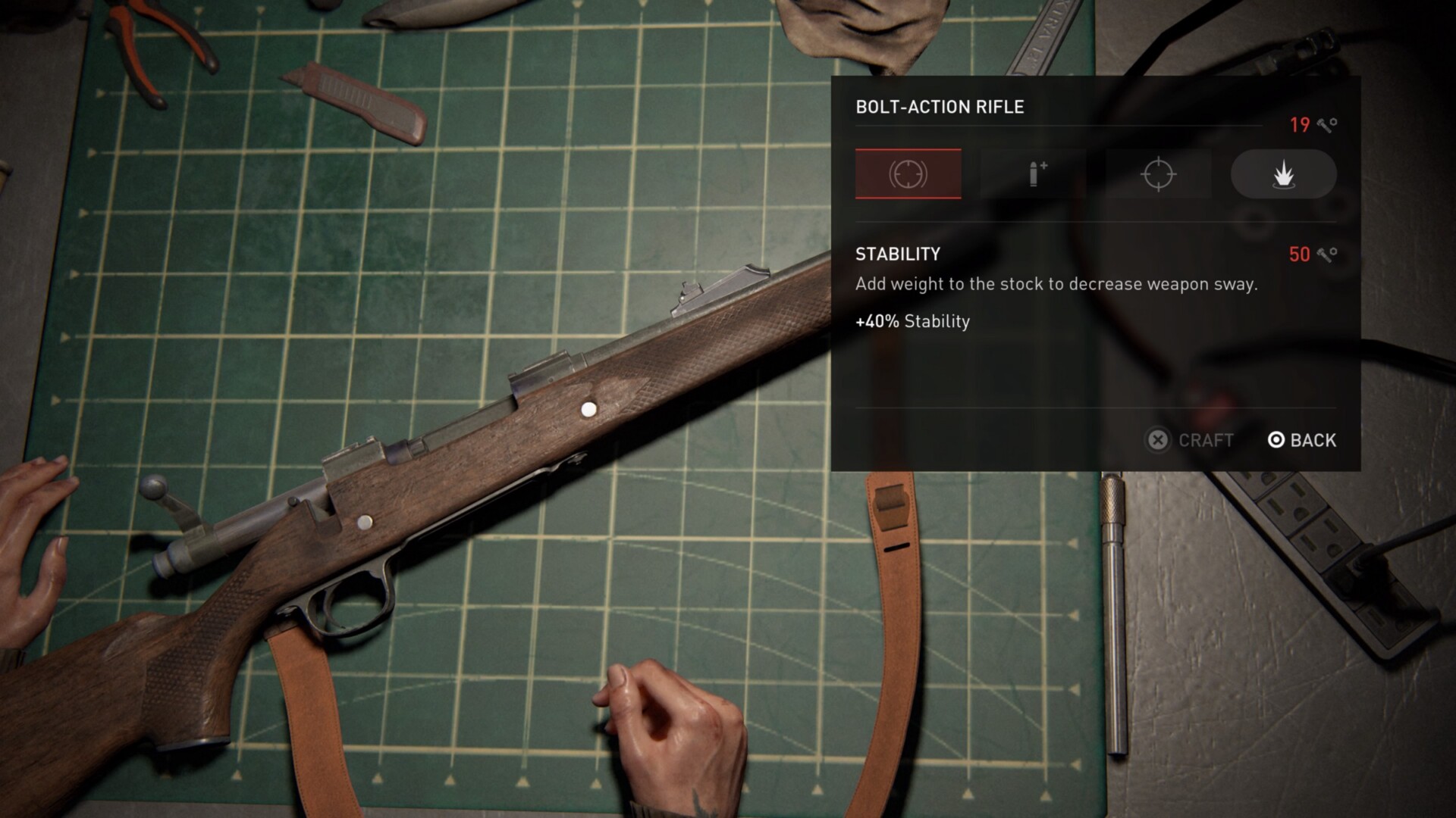
Upgrading the Bolt-Action Rifle in The Last of Us: Part II
In The Last of Us: Part II, finding a workbench and upgrading my weapons felt immersive and engaging, while also keeping the stats extremely easy to understand and the actions snappy.
Watching the character disassemble and reassemble the weapons was incredibly satisfying and helped tell the story of hardened survivors who knew what they were doing.
While the variety of weapons and mods in Cyberpunk would make this type of attention to detail less practical, there could be something to borrow from here.
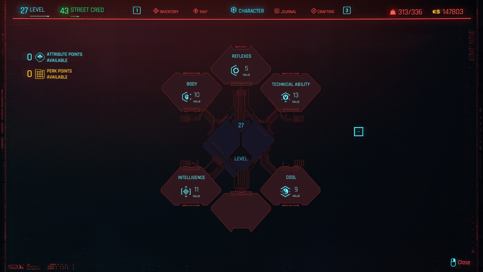
4. Character Screen (Skill Tree)


The main ‘Character’ menu followed by the ‘Technical Ability’ skill section
4.1 Strong aesthetics
There is actually a lot I like about these screens.
Upon entering the Character Screen, the first thing that strikes me is the aesthetics. Using angled connecting lines styled after ribbon cables not only looks cool, but also quickly conveys purpose.
It makes me think of connecting components together to upgrade a device; a visual metaphor that implies the functionality of this screen.
Identity and Relationship
Another aspect of the visuals that works well is how the main Character Screen looks like the parent of the lower levels contained within it. The first screen has fewer larger blocks that are connected by a single thicker bundle of cables. Opening up one of these containers reveals a wider array of smaller components inside.
This identity is unique to the Character section, making these screens feel related and memorable — but also contributes to the feeling of opening my character up and tinkering with the tech within.
Bold Icon Choice
Lastly, the icons are fairly unique. When designing a feature like this, I’d usually opt for much simpler icons that focus on clear communication. However, I actually like the bolder choice of these heavily illustrated icons.
While they allude to the meaning more subtly, they do build strong personality. In this context maybe it works; it’s not actually crucial that the player can infer the exact meaning of the icon, since the skills are sufficiently complicated that reading the tooltip would be necessary regardless. Plus, those illustrations are unique enough that once the meaning has been learned, the player can more easily associate and memorise them.
4.2 Screen Breakdown
While I have praise for this screen, it’s also worth breaking it down to see where it could still be improved from a UX standpoint, which I’ve labelled below.
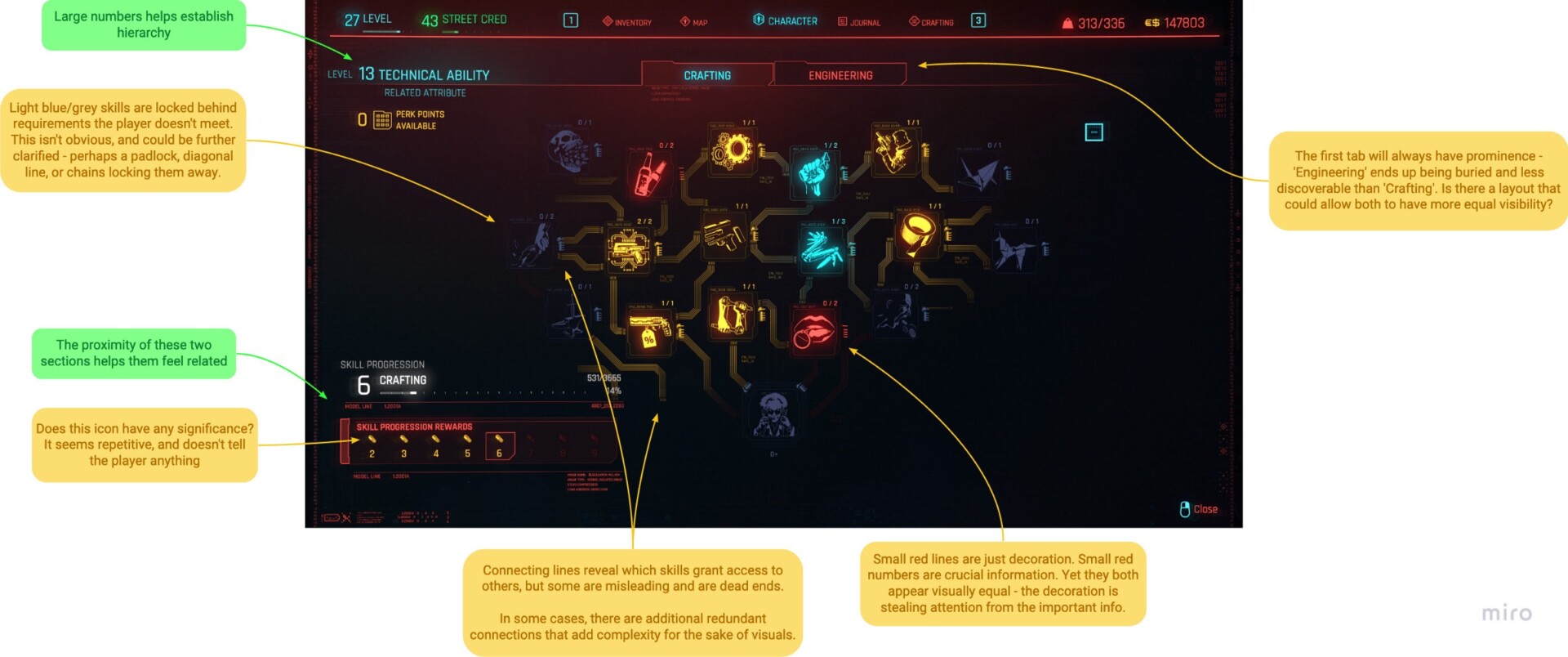
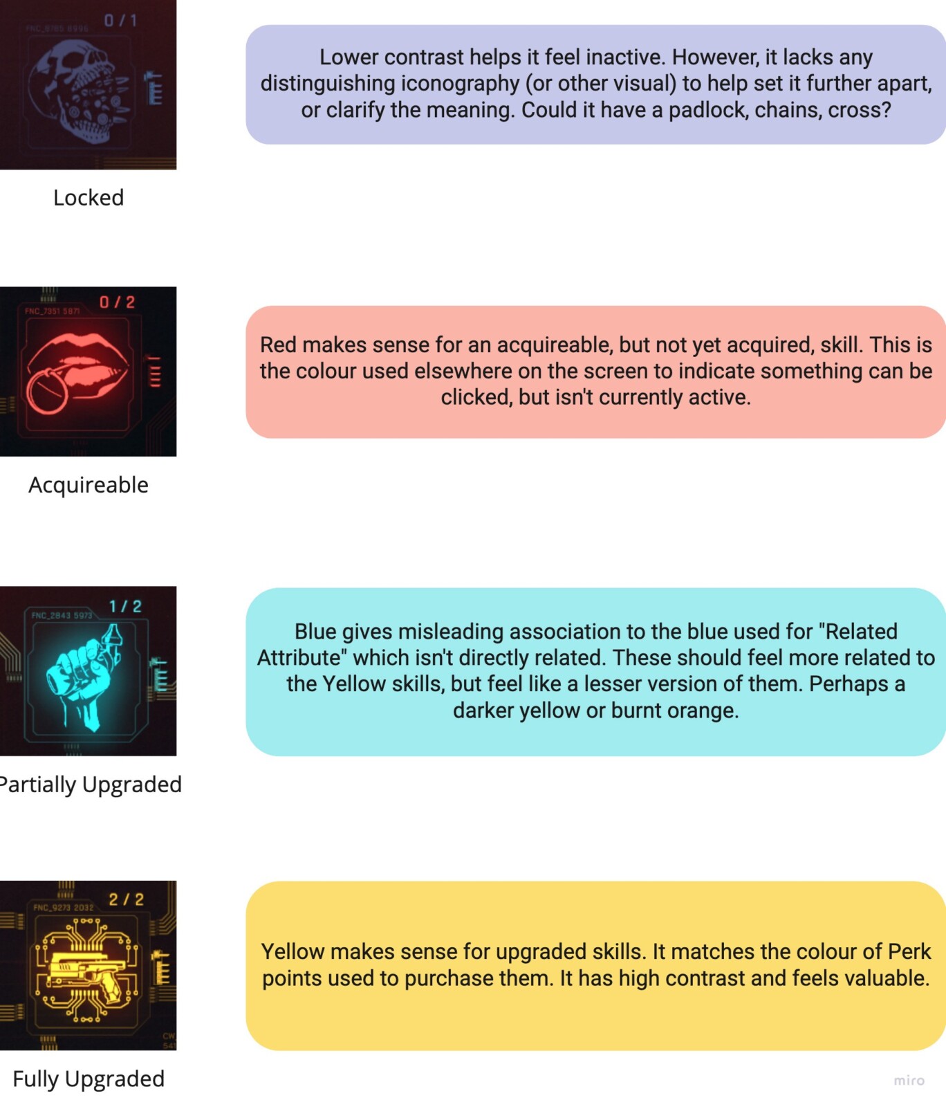
4.3 Clarity of states could be improved
Next is a point on visual language. A large consideration of any skill tree is how to clearly communicate the different states within. As a player, what have I unlocked? What can I afford? Which skills are unattainable until I reach a certain level or are dependent on another skill?
5. HUD
When it comes to the main HUD, other than the aforementioned issues with way-finding, I think most aspects work well.
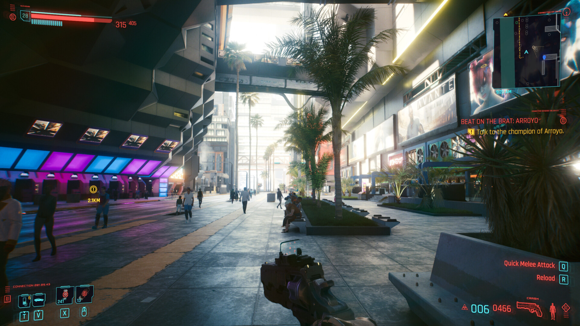
Cyberpunk 2077’s primary HUD
- Infrequent interactions such as accessing your phone or vehicle are given less prominence vs your quick-access slots.
- Health is easy to read and displayed dynamically (if it’s full, it will not be shown).
- Similarly, Stamina only shows when you are actively depleting it.
- Quick-hack RAM has a unique silhouette that helps with memorability and theming.
- Quest information is easy to read without being obtrusive.
- Slight perspective/distortion and (optional) chromatic aberration help the elements feel a part of the world, reminding you that they are part of V’s optic enhancements.
If the HUD suffers from anything, it’s probably ‘too much information’.
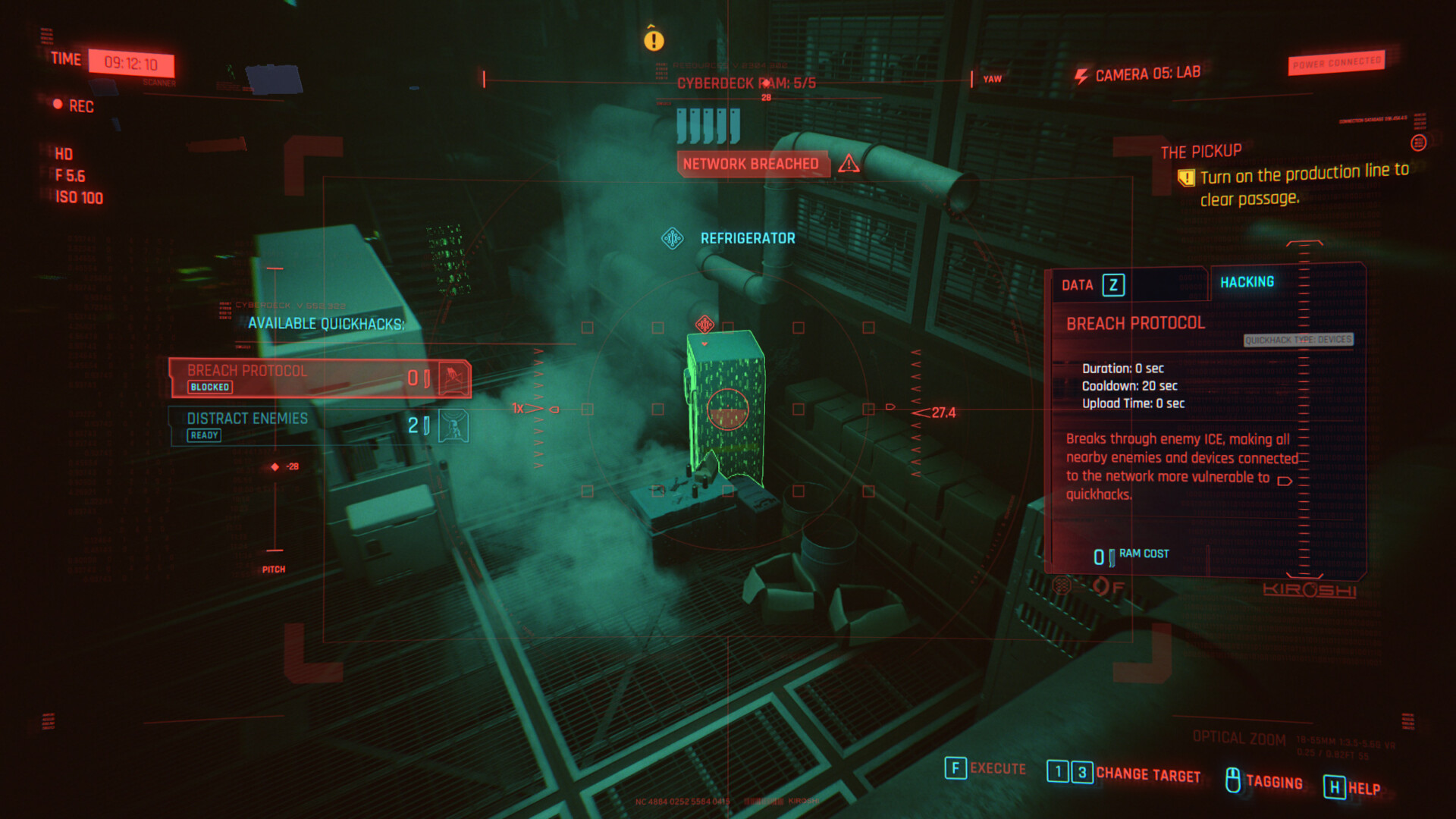
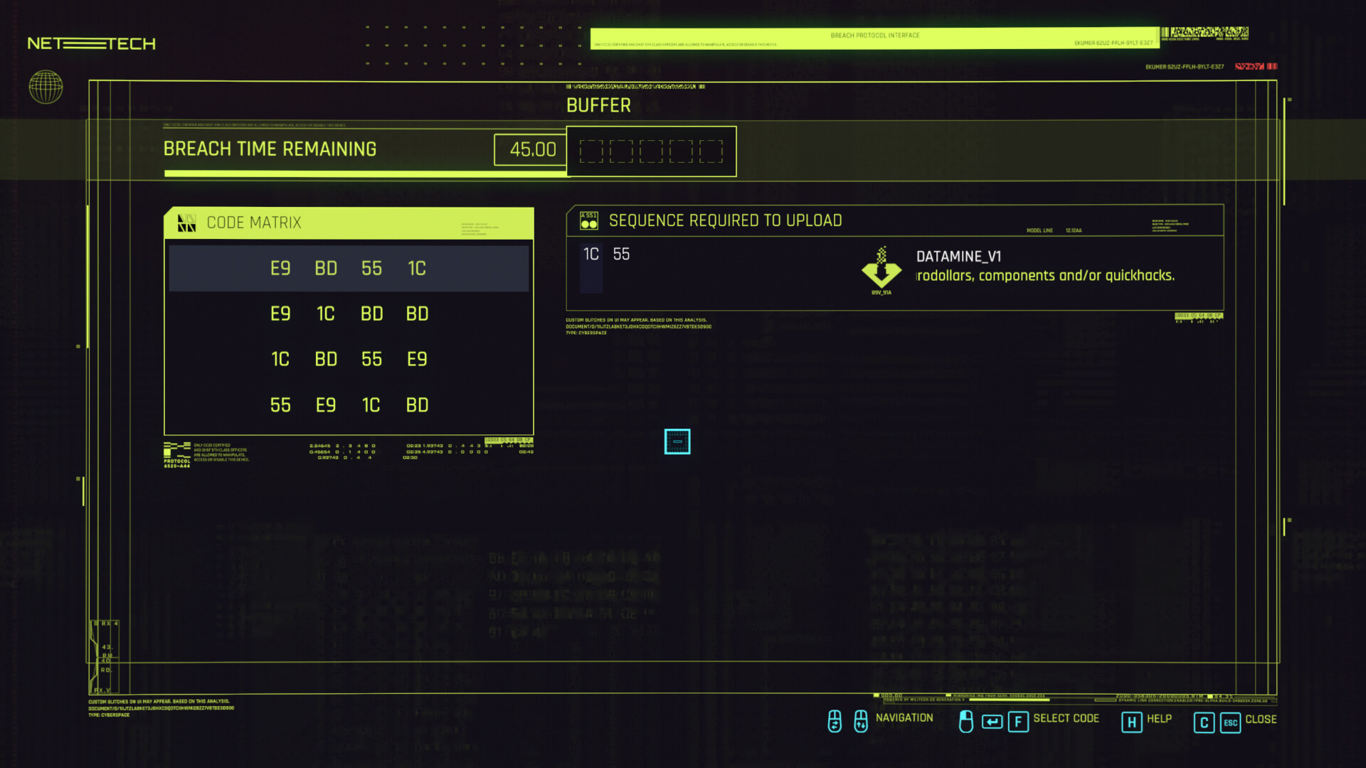
Hacking a security camera has a cool interface that could be improved with some tighter visual guidelines
Cyberpunk 2077 occasionally leans too hard into the decorative elements that say “look at me, I’m high tech”. Often labelled ‘FUI’ (the ‘f’ can stand for fictional, fantasy, fake, etc) this type of purely stylistic UI doesn’t exist to serve a purpose for the user aside from storytelling. Think Star Trek and Iron Man.
Used carefully, FUI can be an important thematic device in video games. Mis-use can cause distraction or confusion.
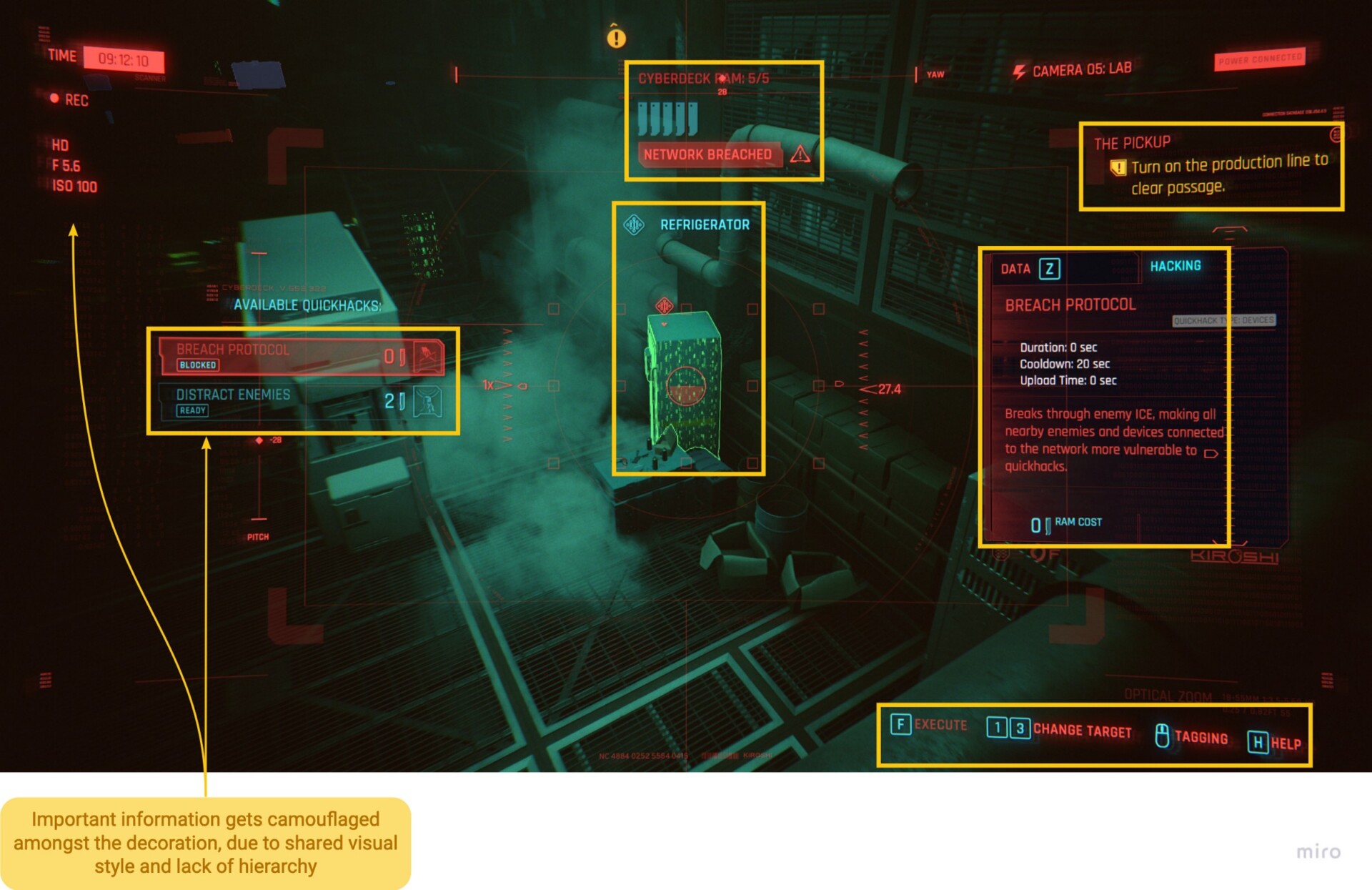
In this case, I think it could benefit from some tighter visual rules. In the hacking interface above, there is a variety of important information highlighted in yellow: available quickhacks and their descriptions, current RAM, data on the highlighted object, key binds and quest info.
Unfortunately, all of this is muddled in with lots of visually identical information that doesn’t serve any functional purpose.
The solution could be as simple as assigning a unique colour scheme to decorative elements (right now almost everything shares the same shade of red), as well as using size and opacity to push them lower in the hierarchy.
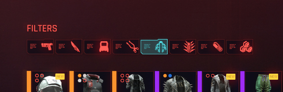
The ‘Filter’ tabs as seen in various inventories throughout the game
This problem can be seen elsewhere throughout the UI, such as with the icons on these tabs. Fussy decorative details next to the icons take up space and distract from the icon itself, which already suffers from being too detailed at this scale. This space could be better used to give the icons more breathing room or potentially make them larger.
While I think this type of decorative element can add some valuable personality to an interface, it’s better used when it’s not crowding important information.
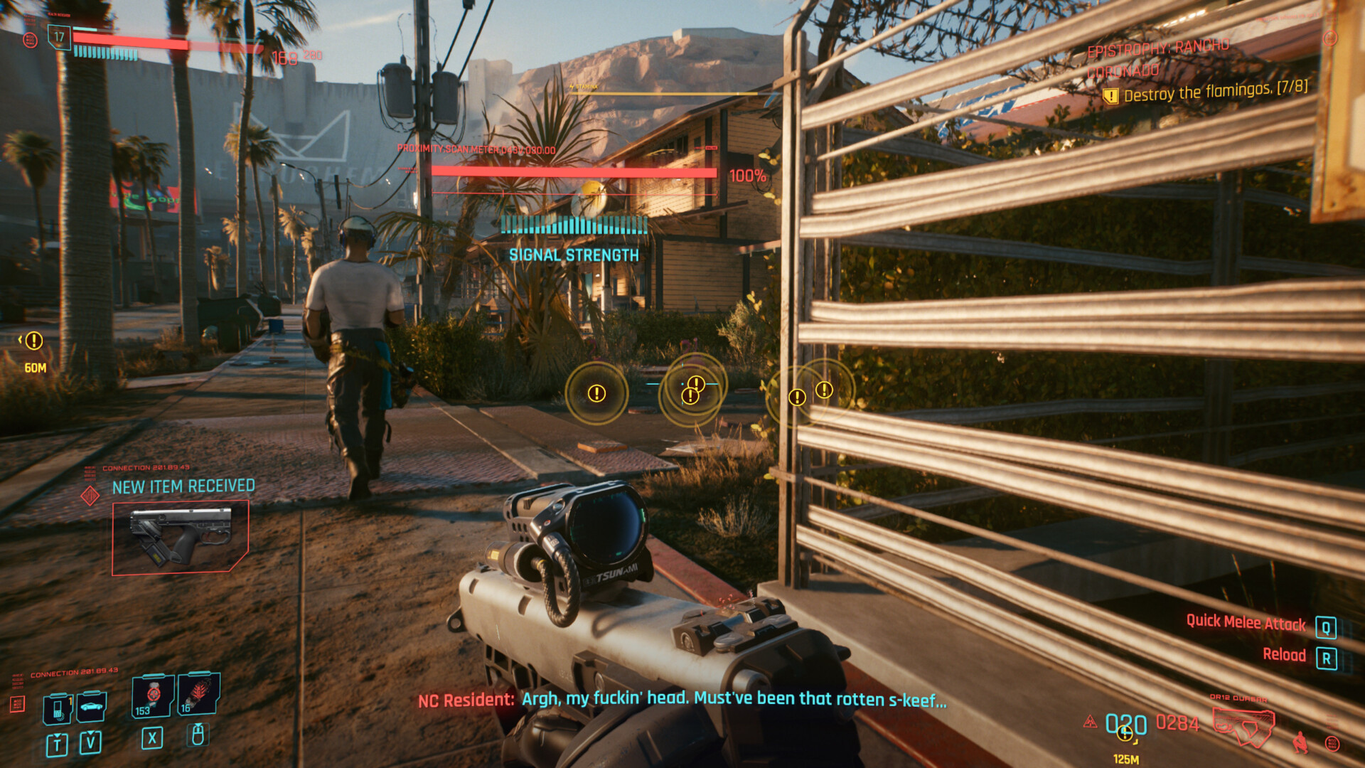
Normally the mini-map would also be visible here, but I had it disabled. So this isn’t even a worst case scenario…
Despite being someone who loves studying UI, there were many times during gameplay where even I got pretty sick of seeing it. Information overload was a problem, cluttering and spoiling the view. Whether it was NPCs that wouldn’t stop calling me to sell me a car or too much information about my current quest, I just wanted the game to be quiet and let me enjoy it.
From a design perspective I believe we need to be brutal in minimising information to only what the player really needs at the time.
- Is a large icon of the new weapon they just picked up 100% necessary?
- Does every objective deserve a quest marker?
- Can any of the interface be offloaded into a more contextual, spatial sense?
- Can infrequently accessed features be behind a button press?
- Could certain elements work with a reduced footprint (such as a compass vs a mini map)?
- How much decoration is too much?
With the increased complexity of modern games, I can completely appreciate the difficult balancing act balancing between too much and too little. As well as skilful treatment of the layout and style of the UI itself, I also think the problem can be tackled from other perspectives — a close relationship between gameplay mechanics and UX, for example.
Alien Isolation’s Motion Tracker (Source)
In Alien Isolation, the motion tracker was implemented as an item that Amanda Ripley could equip to track movement.
This could have been a persistent 2D HUD element, but instead became a creative device that minimised the UI on screen and also served to:
- Build tension by making Ripley vulnerable while holding the tracker.
- Add sound effects that enemies can hear while using it.
- Tell the story through the technology of the Alien universe.
- Gate the mechanic until the player has progressed far enough to acquire the device.
As a designer, I think this type of relationship between gameplay and UX/UI shouldn’t be overlooked. Surely the Cyberpunk genre is the ideal vessel for this, and more utilisation of that could have really elevated the experience.
6. Controls and Configuration
Lastly, I wanted to touch on a few quick wins. These problems aren’t deep rooted but solving them would help add a level of extra polish or quality of life to the game’s interactions.
6.1 Lack of Control Customisation
On PC (and increasingly on Console) players expect a certain degree of freedom in control customisation. As well as for accessibility reasons, it allows players to tune a game based on their preferences.
Accessing the Inventory is typically assigned to ‘I’ on the keyboard but I will always swap it to ‘Tab’ because I can press it with my left hand. I’d also normally expect individual shortcut keys to get straight to the Journal, Map or Character screens so I don’t have to step through the menu every time.
This isn’t possible in Cyberpunk. I had to install a mod and manually edit the game’s config file instead.
6.2 Bulky Cursor on PC
Using a clunky blue square for the cursor feels odd on PC
As with many recent titles, Cyberpunk opted for a free-cursor design on Console as well as PC, a pattern popularised by games such as Destiny and Assassins Creed: Odyssey.
The visual graphic used for the pointer itself is a bulky square, even when using a mouse on PC. Perhaps this isn’t as bothersome with a controller, but I found it to feel clunky and imprecise. A smaller circle, crosshair, arrow or hand shaped icon would have been preferable.
6.3 Sticky Sliders
Using the mouse to try and click and drag the slider doesn’t work
It sucks to complain about something so mundane. For some reason, though, the sliders in Cyberpunk 2077 feel terrible to use with a mouse. It’s not possible to grab the handle and drag it smoothly, instead it jitters unpredictably and the player has to try and click the point where they want it to land.
3 options: Click, drag or type. The handle and cursor are also much more precise.
Apex Legends lets the player drag the handle precisely, but also type the value manually. An unusually simple thing to mess up, but it frequently annoyed me.
These last few problems will seem minor on their own. But when combined with the many other issues dotted throughout the game, the experience quickly amounts to “death by a thousand cuts”. With games like The Last of Us: Part II really paving the way for buttery smooth, highly accessible and customisable experiences, Cyberpunk 2077 will need to try harder or risk being left in the dust.
Final Thoughts
(Source)
Beautiful, but flawed
Cyberpunk 2077’s stylish interface complements a beautiful world that is unfortunately interwoven with UX slip ups and unimaginative design decisions, resulting in a game that does a lot of things alright… but almost nothing exceptionally.
Yes, fixes are within reach…
UI patches will likely bring many QoL improvements that ease frustration. In my opinion these should be focused around the HUD, general navigation and inventory management. With such an evidently talented team at CDPR, more time to test and iterate could allow for plenty to be done.
(Source)
…But I’m not sure if any patch can save it
Strictly speaking about UX/UI, Cyberpunk 2077 really isn’t that far off. Most of the issues I highlighted around efficiency have relatively simple fixes. Extending the analysis a little further out, though, into those other issues that sit on the edge of UX and Game Design… will a few updates really suffice?
Jumping in with hopes for the next leap in immersive and meaningful storytelling was ultimately disappointing. While my expectations were modest compared to some, I still expected a high bar to be hit.
At times it felt like the game’s ultimate vision was splintered, with each discipline struggling to complement each other. Beautiful environments were ruined by a distracting HUD. Compelling quest writing was invalidated by a heavy hand that coddles the player through each objective. This only reinforces the importance of those deeper decisions that impact the player’s overall experience, those which stem from a combination of Game Design and UX Design. Decisions that build a relationship between the player and the surrounding world, rather than pull them out of it.
Buried under Night City is a vast amount of potential, but I’m not confident that a few patches will be enough to fully uncover it.
Thanks for reading!
Hopefully this has been insightful to anyone interested in the topic of interfaces within video games, whether you are already working in the field or maybe just curious about it.
UX/UI for games is something that can be under appreciated or difficult to find material on, so it’s something I’d like to expand the discussion around.
I welcome any thoughts you have, and am very interested to hear other takes on this — from players and designers alike.
In the future I plan to expand my writing, such as with more technical analyses or comparisons between games.
Recent articles
Interview with Stephan Dube
Principal UX | UI Designer at Arrivant

Wireframe Video Game Design
60+ Wireframe Mockup PSD Design
Interview with Michal Jarolimek
UI programmer at Warhorse Studios
Interview with Marc Sodermanns
Lead UX Designer at Massive - a Ubisoft studio
Interview with Nicolas Kraj
UX Director at Ubisoft and Creator of GDKeys
Interview with David Sheldon-Hicks
Founder at Territory Studio
Interview with Emmanuel Vasquez Jr
Senior UI Artist at Gameloft
Interview with Sarah Robinson
Lead UI Designer at Behaviour Interactive